drawing, paper, ink, pen
#
portrait
#
drawing
#
hand-lettering
#
hand lettering
#
paper
#
personal sketchbook
#
ink
#
pen work
#
pen
Copyright: Rijks Museum: Open Domain
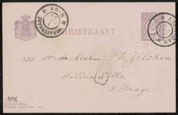
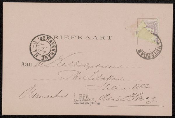
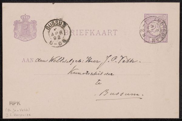
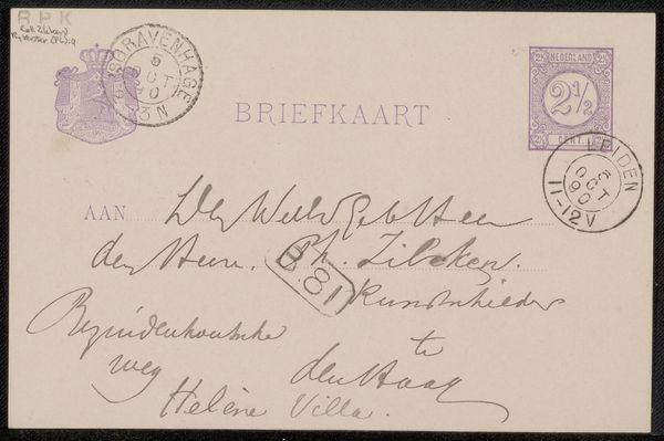
Curator: Here we have George Hendrik Breitner's "Briefkaart aan Jan Veth," likely dating from 1891-1892, held at the Rijksmuseum. It’s an ink drawing on paper. What strikes you first about it? Editor: The austerity of the monochrome palette creates an immediate sensation of constraint. The texture and composition guide me toward a minimalist aesthetic, where only essential elements shape perception. Curator: Indeed. Even on something as mundane as a postcard, there is symbolic intent and layered meaning. The crowned crest, the stamped seal, the calligraphic script… they all speak to a world of established hierarchy and perhaps restricted communication within social circles. Editor: Let's focus on the pen work itself. Look at the varying line weights, particularly in the signature, creating a clear foreground element against the pale, uncoated card. The flourish almost functions as a compositional anchor, directing our eye upwards. Curator: A practical element with unintended artistry. We could consider Jan Veth’s influence, too; the recipient was an artist and critic, making this more than a simple greeting. The “RPK (Br. Jan Veth) G.H. Breitner: 10” inscription might even imply a transaction or exchange within an artistic community, a system of value that still echoes today. Editor: The tension between the spontaneity implied by a postcard and the clear attention paid to lettering introduces ambiguity. Is this merely functional correspondence, or a deliberate performance of taste through textual structure and style? Curator: Exactly! Everyday items become imbued with significance. By looking at this simple postcard we glimpse into the social and creative exchange between artists and how cultural messages are inscribed, sometimes inadvertently, onto the objects of our lives. Editor: Looking at it again, the framing invites us to think beyond simple correspondence, opening it to broader considerations regarding the period’s creative intent through minimalist form and austere design. Curator: I think you are right to sense those details of intent. Thanks to that focus, it's hard to look at any correspondence the same way!
Comments
No comments
Be the first to comment and join the conversation on the ultimate creative platform.
More like this