tempera, painting
#
portrait
#
medieval
#
narrative-art
#
tempera
#
painting
#
sienese-school
#
painted
#
figuration
#
oil painting
#
christianity
#
history-painting
#
italian-renaissance
#
christ
Copyright: Public domain
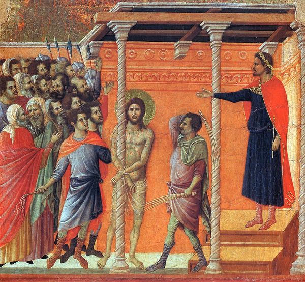
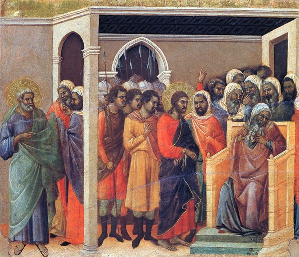
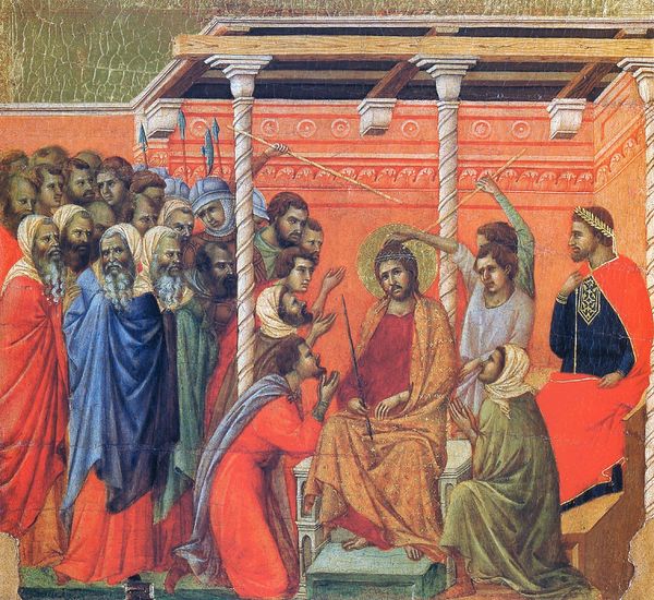
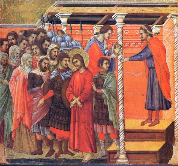
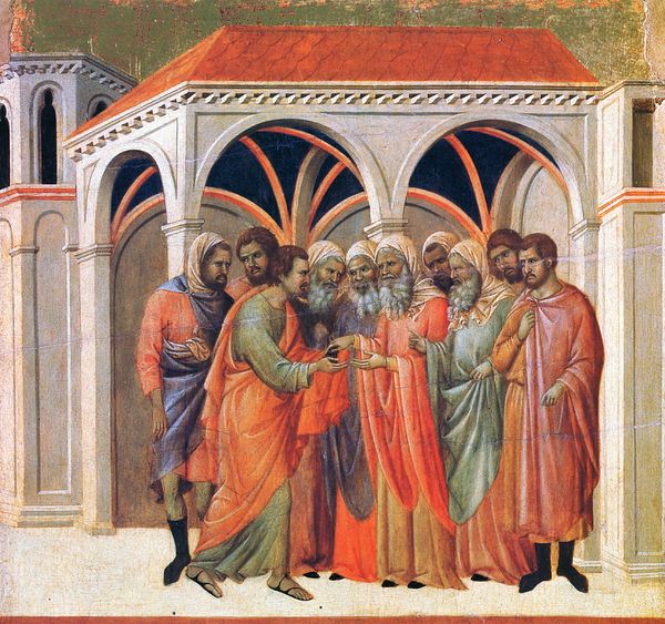
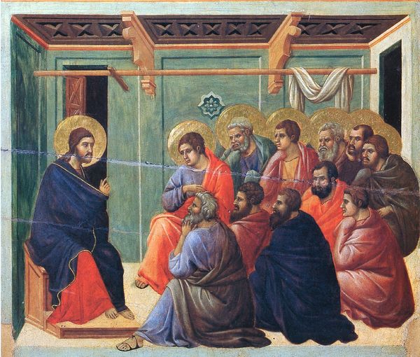
Editor: Here we have Duccio's "Christ before Pilate," made with tempera around 1311. It strikes me how spatially compressed the scene feels, everyone's crammed together. How do you read this composition? Curator: Consider how Duccio employs hierarchic scale. Pilate, though physically seated, is rendered smaller than Christ. What effect does this have? It directs the viewer’s gaze toward Christ, despite his passive posture and the presence of more figures surrounding him. Note also the use of line—the sharp, unwavering contours that define each figure, creating a sense of visual clarity. Editor: I see what you mean. The sharpness almost flattens them against the gold background. Is that deliberate? Curator: Precisely! Observe the application of color, the careful distribution of reds and blues throughout the composition. This contributes to a sense of balance, but also highlights key figures and reinforces the symbolic narrative. The spatial compression serves not to mirror reality but to enhance the emotional intensity and symbolic weight of the scene. Editor: So, the composition isn't about realism, but about emphasizing certain figures through color, line, and proportion? Curator: Precisely. It is a calculated arrangement of forms designed to convey a specific meaning and elicit a particular emotional response. Look closely at the texture. Can you infer what material it's painted with? Editor: It appears to be made of a material that makes the colors look vivid and shiny. So it could very well be tempera! Curator: Indeed. And the flatness, resulting from Duccio's handling of the medium, underscores the iconographic function of the painting, turning it into a vehicle for spiritual contemplation rather than naturalistic representation. Editor: I've never thought about it that way before. It's all about the shapes and colours to emphasize symbolism, and make one's reading and understanding of the artwork and religious background more palpable. Curator: Indeed, there is significant meaning encoded into its composition. It underscores that art does not reflect reality. Rather it is one way we process what’s relevant for us.
Comments
No comments
Be the first to comment and join the conversation on the ultimate creative platform.
More like this