engraving
#
baroque
#
figuration
#
line
#
history-painting
#
engraving
Dimensions: height 132 mm, width 119 mm
Copyright: Rijks Museum: Open Domain
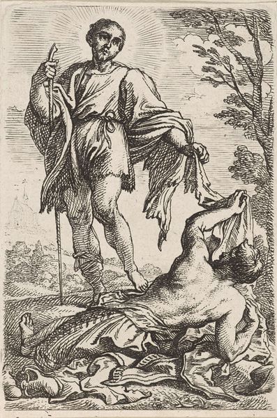
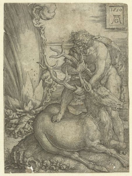
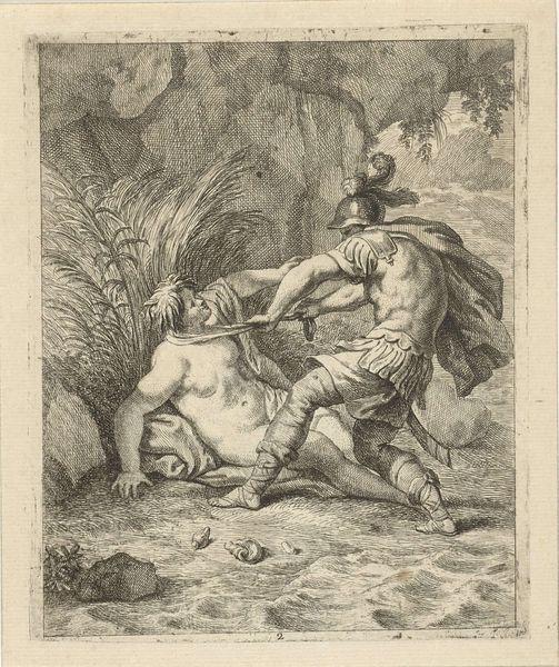
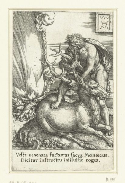
Editor: This engraving, titled "Simson Doodt de Leeuw," created by Frans van den Wijngaerde sometime between 1636 and 1679, really jumps out. The energy in the lines is palpable! I’m curious, from your perspective, what strikes you most about this work? Curator: The dynamism, wouldn't you agree, is generated through the interplay of opposing forces: light versus shadow, movement versus stasis. Notice how the engraver manipulates line density to create tonal contrasts, thereby shaping the musculature of Simson and the lion. The composition leads our eyes to constantly dance between struggle and deadlock. Editor: So, it's the formal contrasts that really make it pop? Are you focusing less on what it's *about* and more on *how* it's rendered? Curator: Precisely. We must ask ourselves how the artist constructs meaning. Is it the subject itself or the articulation of that subject that commands our attention? Look at how the curves describing the lion's mane play against the hard angles delineating Simson’s thighs. Form dictates function, does it not? Editor: I see what you mean. It's less about the story of Samson killing the lion and more about the visual language used to portray that struggle. The linework almost creates a sense of… texture and movement. It’s less about the narrative and more about… pure form? Curator: Indeed. To understand it formally is to understand its essence, freed from any anecdotal distraction. What do you think you've learned from this formal assessment? Editor: I suppose I learned to look past the "what" of the story to appreciate the "how" of the artist’s choices. Thinking about composition and linework as active tools for creating drama is definitely a new perspective for me.
Comments
No comments
Be the first to comment and join the conversation on the ultimate creative platform.
More like this