acrylic-paint, site-specific, installation-art, architecture
#
acrylic-paint
#
geometric
#
site-specific
#
installation-art
#
abstraction
#
abstract composition
#
modernism
#
architecture
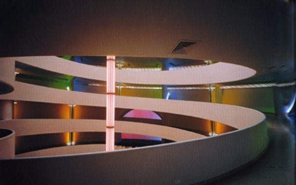
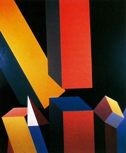
Copyright: Daniel Buren,Fair Use
Here, Daniel Buren gives us ‘Double Rhythm’ with paint and stripes and light all doing their thing. The way Buren uses color here is super interesting, right? Those bold rectangles, green, purple, red, like pure color having a conversation with the architecture. Look how he uses those vertical stripes to play with the existing lines of the building. It’s not just about filling a space; it's about making the space itself do something new. And those colors. They sit so flat, but it’s not a dead flatness; they’re alive with the potential to make you feel something, especially in relationship to the cool and warm lights from above. I love that this work is site-specific, made for a particular place, like it was always meant to be here, but also challenges how we see that very place. It makes me think of what Mondrian was doing with color and grids, taking something rigid and making it sing. Art’s just a big, ongoing conversation.
Comments
No comments
Be the first to comment and join the conversation on the ultimate creative platform.
More like this