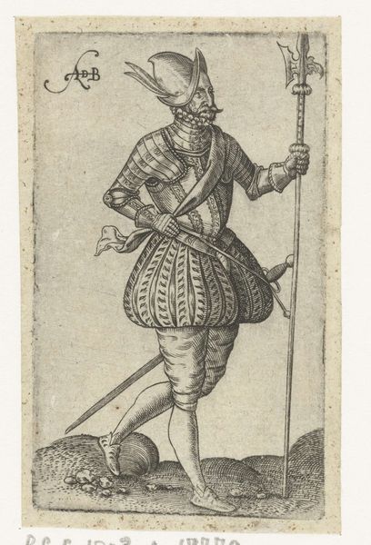
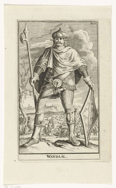
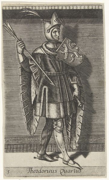
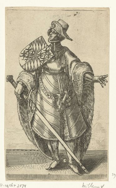
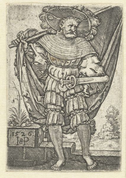
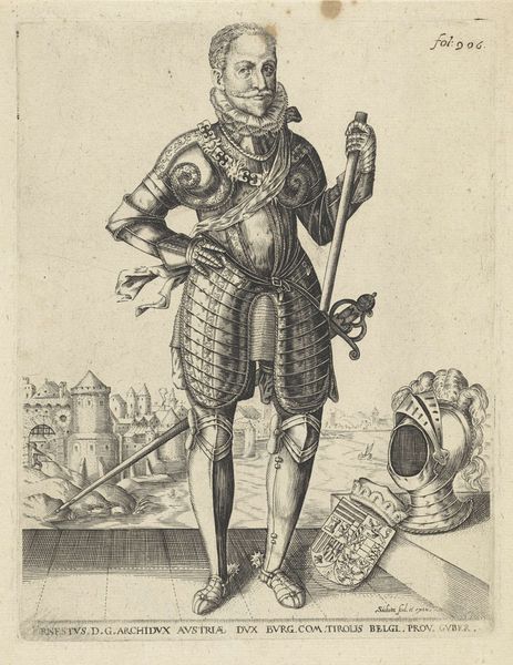
print, engraving
#
portrait
#
baroque
#
dutch-golden-age
# print
#
old engraving style
#
figuration
#
line
#
history-painting
#
engraving
Dimensions: height 130 mm, width 80 mm
Copyright: Rijks Museum: Open Domain
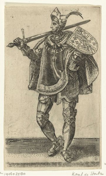
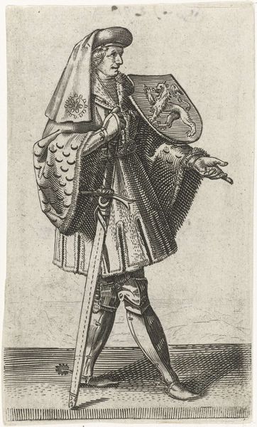
Editor: Here we have Adriaen Matham's "Portret van Jan II, graaf van Holland," created around 1620. It’s an engraving, so the lines are very deliberate. What stands out to me is the subject’s pose; it feels both formal and slightly off-balance. How do you interpret this work, especially given its formal qualities? Curator: The beauty of this engraving lies in the tension created by its formal elements. Observe how the artist meticulously uses line to define not just form, but also texture and depth. The hatching technique gives weight to Jan's attire and armour, while the background remains stark, offering visual contrast. Editor: So it's about the contrast. Can you say more? Curator: Yes, and particularly how line serves to represent a physical reality, but also to construct the image. Consider, for instance, the direction of line. Doesn't it encourage the viewer's eye to roam the plane and cohere this into one striking form? And is there something interesting at play in Matham’s approach to the material—an appeal not to mimesis but to structural balance, even, perhaps, architectural coherence? Editor: That's insightful. I was so caught up in the historical aspect I missed the visual structure. Curator: It's a testament to the strength of the formalist approach. By understanding the inherent qualities, structure, and composition, of the art, and even its materiality, one is rewarded. The rest emerges from that encounter. Editor: This perspective really sheds new light on engravings. Thanks!
Comments
No comments
Be the first to comment and join the conversation on the ultimate creative platform.
More like this