Brief aan Jan Ponstijn en Henriëtte Johanna Petronella van Hilten Possibly 1939
0:00
0:00
leogestel
Rijksmuseum
drawing, paper, ink
#
drawing
#
dutch-golden-age
#
paper
#
ink
Dimensions: height 261 mm, width 211 mm
Copyright: Rijks Museum: Open Domain
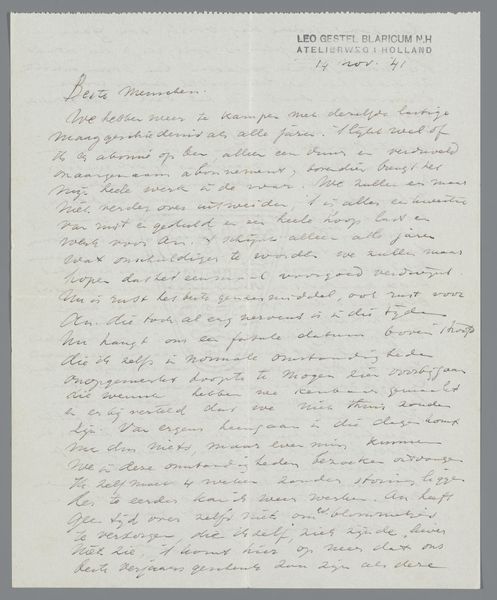
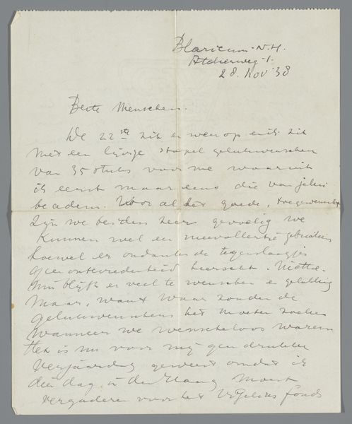
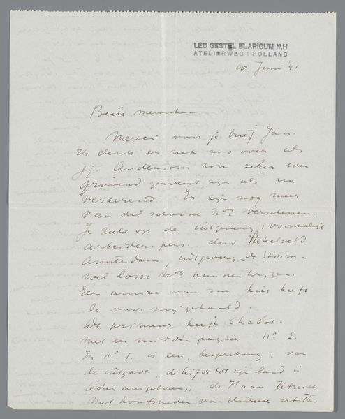
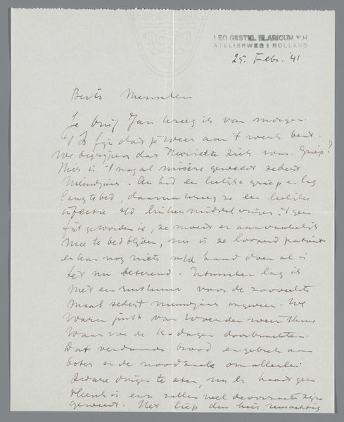
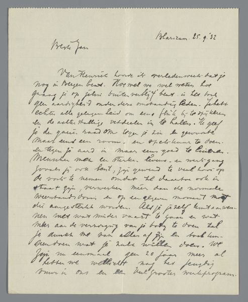
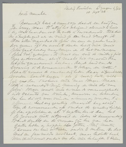
This letter, composed by Leo Gestel in 1939, to Jan Ponstijn and Henriëtte Johanna Petronella van Hilten, uses ink, not paint but the gestural quality of the handwriting and the density of the script reminds me of some abstract paintings. Look at how the letters crowd each other, some words almost illegible. The texture here isn’t about impasto, but about the layering of meaning and feeling. The dark ink creates a stark contrast against the pale paper, giving the words a palpable weight. There’s a rhythm to the script, a kind of frantic energy that feels both intimate and urgent. Gestel's later landscape paintings, though different in subject, share this sense of underlying anxiety. Both, in their own way, grapple with the weight of the world and the fleeting nature of existence. It is this quality that reminds me of the letters of the artist Cy Twombly, both have a painterly quality. Art is about dialogue, a conversation across time and mediums, and always embraces the multiple meanings within.
Comments
No comments
Be the first to comment and join the conversation on the ultimate creative platform.
More like this