drawing, paper, ink, pen
#
drawing
#
hand-lettering
#
hand drawn type
#
hand lettering
#
paper
#
personal sketchbook
#
ink
#
idea generation sketch
#
sketchwork
#
hand-drawn typeface
#
sketchbook drawing
#
pen
#
sketchbook art
#
calligraphy
#
small lettering
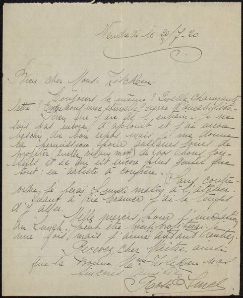
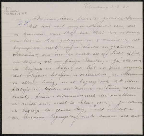
Copyright: Rijks Museum: Open Domain
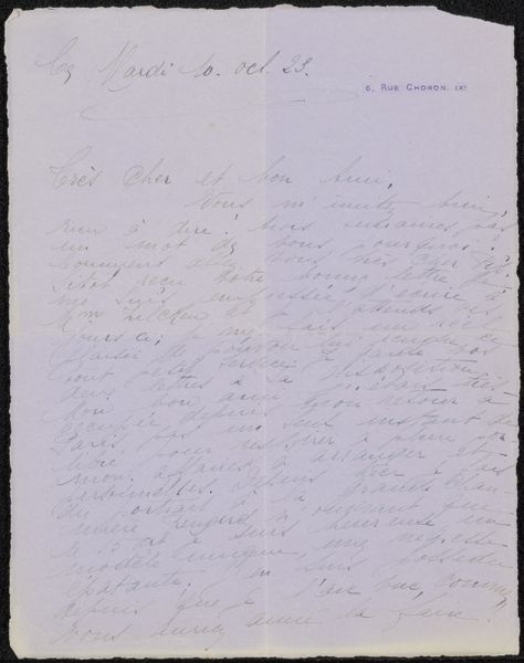
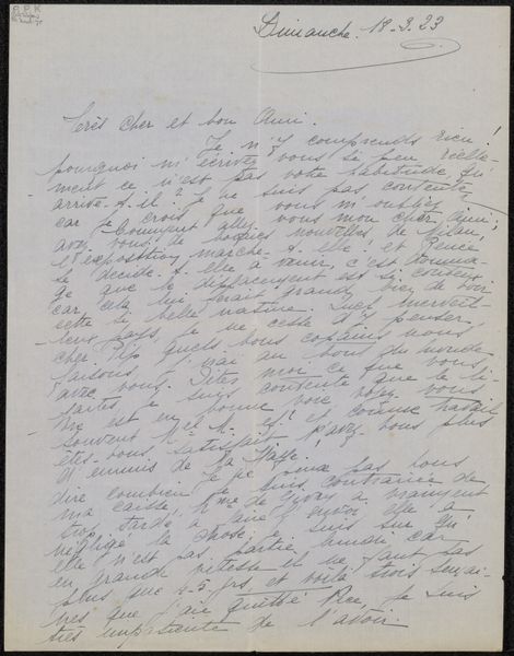
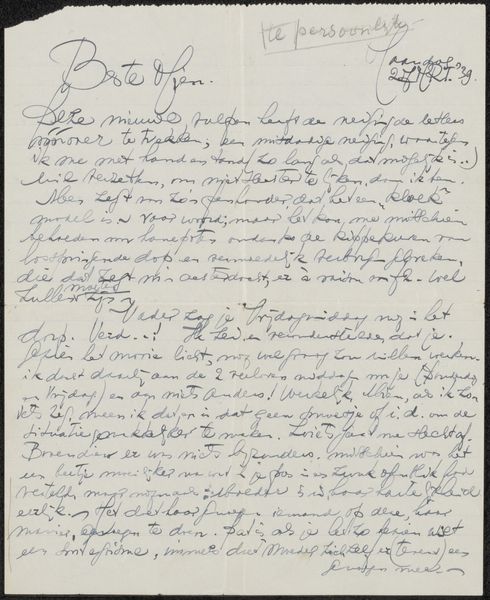
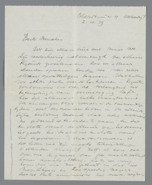
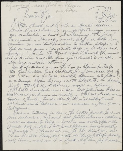
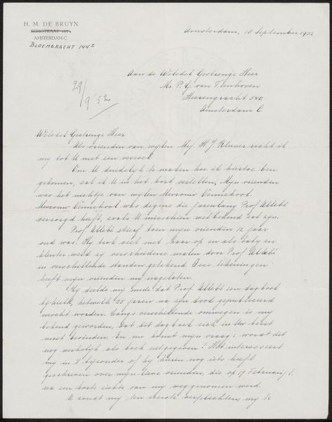
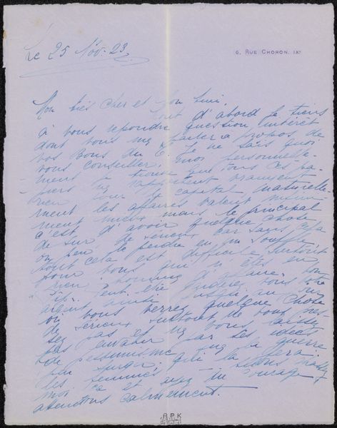
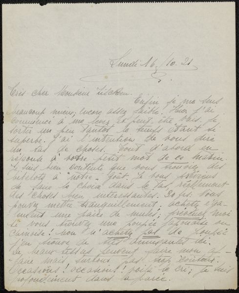
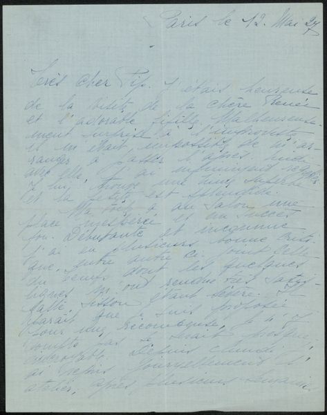
Editor: We’re looking at “Brief aan Philip Zilcken,” potentially from 1922, creator unknown. It’s ink on paper, so, essentially, a handwritten letter. What strikes me is how intimate it feels, like stumbling upon a very personal artifact. It has such delicate small lettering! What do you make of it? Curator: Intimate is precisely the word. It feels like peering over the shoulder of someone in deep thought. The cursive script itself, that controlled chaos, speaks volumes. Notice how the letterforms dance and lean, almost as if whispering secrets across the page. What do you notice about the layout and spacing? Editor: It feels somewhat disorganized, like a stream of consciousness… not particularly concerned with the formal conventions of letter writing. Curator: Exactly! Which is itself quite telling. Letters, then as now, can be so performative. But there is a kind of vulnerability, an honesty in disregarding neatness. The visual hierarchy created is through a personal, intuitive system of emphasis. It suggests someone wrestling with thoughts, prioritizing them in the moment. It’s about the process of thinking, more than perfect presentation. Does the visual noise amplify any assumptions you have made? Editor: I suppose it does… There’s a frantic energy to it that suggests some level of emotional urgency. Curator: Indeed. For me, it’s a beautiful reminder that even seemingly mundane ephemera can hold profound emotional and artistic value, right? Editor: Definitely changes my perception. Thanks, that was helpful! Curator: My pleasure! There’s beauty to be found in the smallest details.
Comments
No comments
Be the first to comment and join the conversation on the ultimate creative platform.
More like this