drawing, mixed-media, print, paper, photography, ink, pen
#
drawing
#
comic strip sketch
#
mixed-media
#
pen drawing
# print
#
pen sketch
#
hand drawn type
#
paper
#
photography
#
personal sketchbook
#
ink
#
pen-ink sketch
#
pen work
#
sketchbook drawing
#
pen
#
storyboard and sketchbook work
#
sketchbook art
Copyright: Rijks Museum: Open Domain
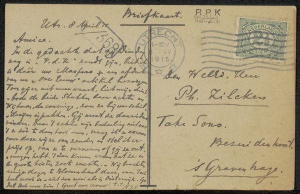
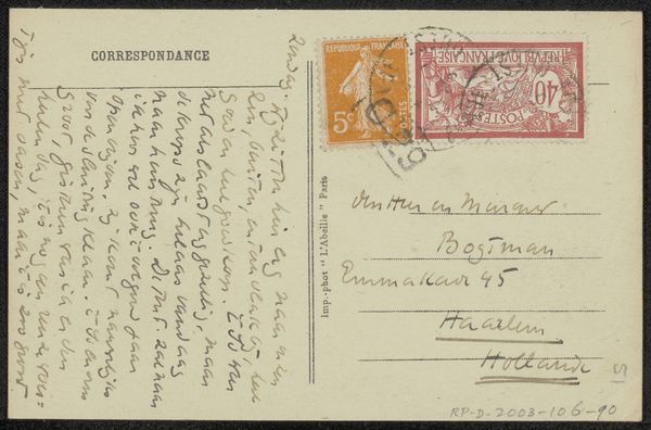
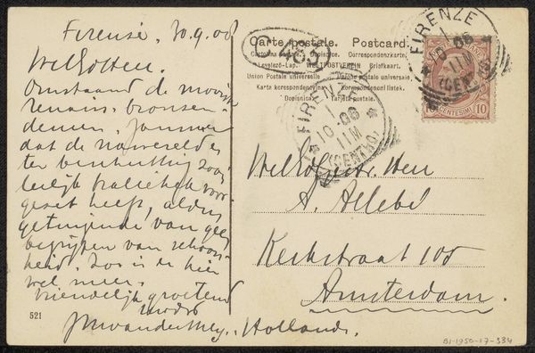
This is a vintage postcard to the Willem Bogtman family. What strikes me first is the handwriting—the way the words are formed, the pressure of the pen, the rhythm of the script. You can tell a lot about a person from their handwriting. The ink bleeds slightly into the paper, and here and there it pools, so you can almost feel the surface of the card and the way the ink interacts with it. There's a real physicality to it, a trace of a human hand. It's interesting how something as simple as handwriting can be so expressive, conveying not just information, but also emotion and personality. The stamp is quite wonderful too, with its muted colors, and the image of Chartres cathedral, and the post mark over the top: a reminder of a bygone era of communication. Think of Cy Twombly's scrawls as a modern reference.
Comments
No comments
Be the first to comment and join the conversation on the ultimate creative platform.
More like this