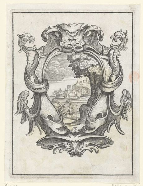
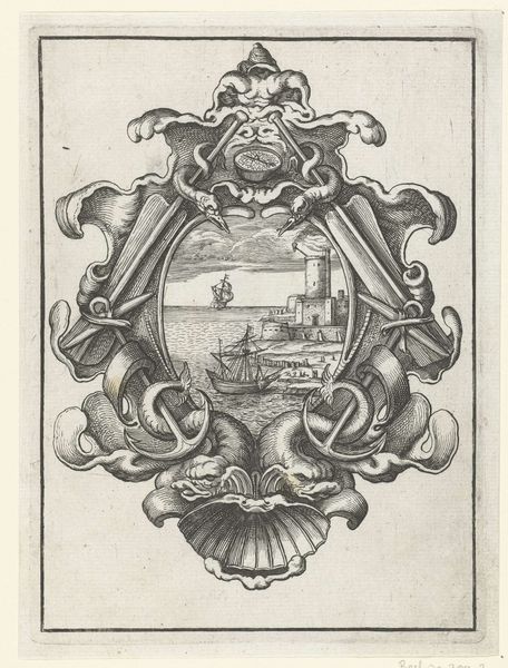
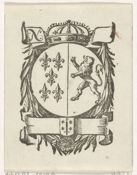
Handelsetiket met de Mont-Saint-Michel, het wapen van de stad Haarlem en het monogram of handelsmerk HVW c. 1681 - 1740
0:00
0:00
drawing, graphic-art, print, etching, ink, engraving
#
drawing
#
graphic-art
#
quirky illustration
#
baroque
# print
#
pen illustration
#
pen sketch
#
etching
#
old engraving style
#
personal sketchbook
#
ink
#
ink drawing experimentation
#
geometric
#
pen-ink sketch
#
line
#
pen work
#
sketchbook drawing
#
cityscape
#
sketchbook art
#
engraving
Dimensions: height 89 mm, width 72 mm
Copyright: Rijks Museum: Open Domain
Curator: This small print, "Handelsetiket met de Mont-Saint-Michel, het wapen van de stad Haarlem en het monogram of handelsmerk HVW," likely dating from the late 17th to early 18th century, offers us a glimpse into the world of early modern commerce and artistic branding. Editor: My first thought? It's wonderfully weird. It feels like a dream mashup—a fortress emerging from the sea paired with the stuffy formality of a coat of arms. Curator: The formal arrangement directs the viewer’s eye according to a specific symmetry. We see the idealized rendering of Mont-Saint-Michel, enclosed in this almost horseshoe shape made of inscriptions, and at its base, a heraldic shield featuring stars and a sword, flanked by curious organic shapes. Editor: The organic shapes you mention, they look almost like bones! Maybe they’re symbolic of protection or history? Either way, they create this wonderful tension with the architectural rigidity of Mont-Saint-Michel. And the tiny figures – they give a sense of scale that's almost playful. Curator: It’s a detail easily missed, but the contrast adds depth. As a trade label, it elegantly intertwines the commercial identity—represented by the monogram—with a sense of place and perhaps, aspiration. The cityscape motif could suggest reliability and far-reaching trade connections, embedding commercial activities within established historical narratives. Editor: You know, thinking about those "HVW" initials, it’s fun to imagine the person behind them. They clearly wanted to project an image of sophistication and worldly ambition. Maybe this quirky little etching was their way of saying, "We're more than just merchants; we're part of history." Curator: I agree, the merging of place and symbol transforms a mundane label into something more evocative. Editor: Absolutely. It reminds us that even in the age of burgeoning global trade, personal narratives and artistic flourishes could still find their way onto the smallest of canvases. Curator: Indeed. It seems that van der Vinne's small creation leaves much to ponder about the nature of ambition and identity in commerce.
Comments
No comments
Be the first to comment and join the conversation on the ultimate creative platform.
More like this