drawing, print, ink, pen, engraving
drawing
pen drawing
pen illustration
pen sketch
ink
geometric
pen-ink sketch
line
pen
engraving
Dimensions: height 94 mm, width 89 mm
Copyright: Rijks Museum: Open Domain
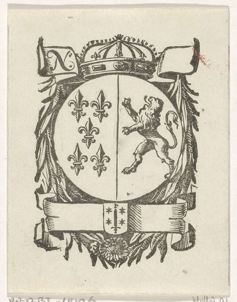
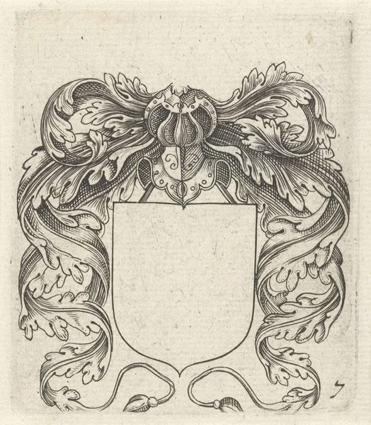
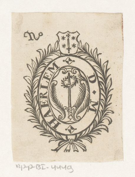
Curator: Here we have an engraving from the 17th century, attributed to an anonymous artist. The work is titled "Vignet met een leeuw en het wapen van de stad Haarlem." It is composed using ink and engraving techniques, rendering sharp, linear details. Editor: It strikes me as quite formal, almost austere, despite the symbolic flourish. The stark black lines against the off-white paper give it a sense of authority. It feels official, somehow. Curator: The composition centers around a heraldic lion within a circular frame. The frame itself is quite ornate, decorated with scrolling foliage and topped with a ribbon-like banner. Above this is a shield bearing what appears to be a sword and stars, completing the coat of arms for the city. Notice the precision of the linework. Editor: And that rampant lion… Such iconography was deliberately chosen and endlessly repeated across the centuries. Its symbolism is loaded, isn't it? Consider how a rising merchant class adopted and adapted traditional heraldry to cement their newfound positions within the sociopolitical hierarchies. What does a Haarlem lion mean within that context? Curator: I find the interplay of geometric forms against the organic flourishes of the frame particularly interesting. The rigid circle containing the lion creates a sense of controlled energy. There's a strong structural integrity to the design as a whole. The engraving uses stark contrasts to emphasize the key elements, guiding the eye. Editor: That's it, isn't it? Guiding the eye, constructing a narrative of power through symbolism and controlled visual language. How complicit is this artist, or the person commissioning this engraving, in maintaining a certain social order? It's far more than just a pretty design. Curator: Perhaps. Though one might also argue that it functions as a straightforward, aesthetically pleasing representation of civic identity. The clean lines and balanced composition lend it a timeless quality. Editor: I suppose that's true too. A visual brand for an emerging civic identity during a transformative time in Dutch history! Thanks for the fresh look. Curator: Indeed, seeing it with a focus on civic history has made me re-examine my position. Thank you for that perspective.
Comments
No comments
Be the first to comment and join the conversation on the ultimate creative platform.