About this artwork
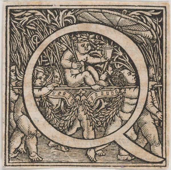
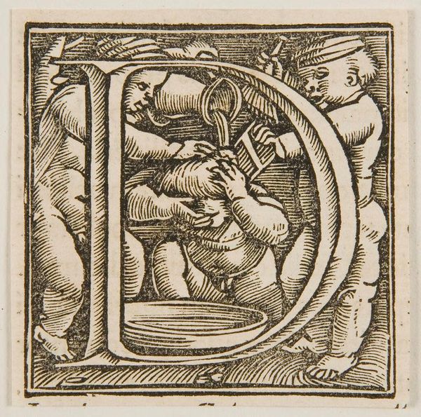
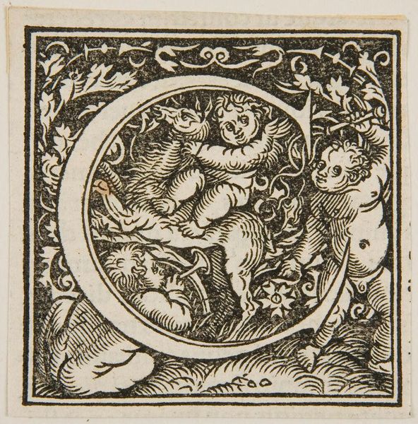
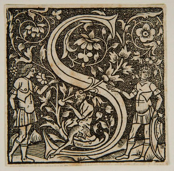
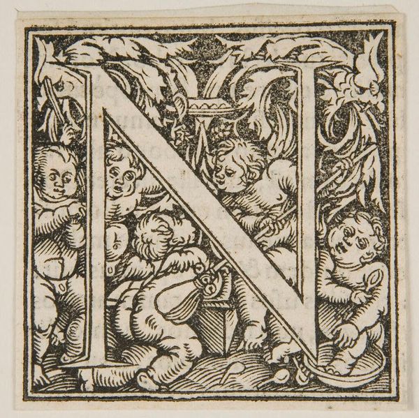
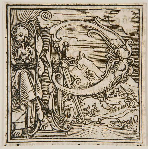
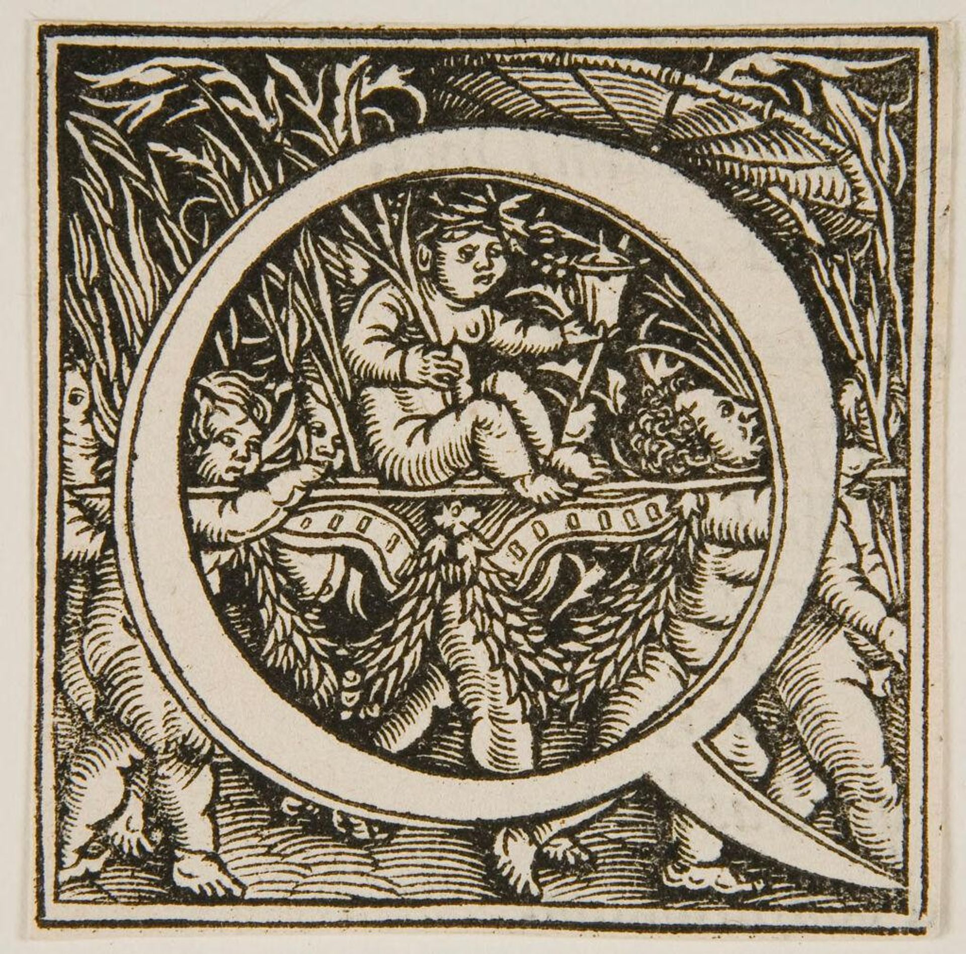
Editor: Here we have "Initial Q" by an anonymous artist, currently residing at the Harvard Art Museums. It feels very dense and ornate. What strikes you most about its composition? Curator: The interplay between the organic and the geometric is quite compelling. The rigid, defined "Q" provides a structured boundary, while the figures and foliage within and around it introduce dynamism and a sense of contained chaos. Note the contrast between the smooth curve of the letter and the textured lines describing the figures. Editor: That's a keen observation. The texture definitely adds a layer of complexity. What about the lack of color? Curator: Precisely. The absence of color directs our focus to the tonal variations and the artist's skillful use of line to create depth and form. How do you feel about the distribution of light and shadow? Editor: I see what you mean, it guides the eye. I hadn't considered the balance between structure and dynamism. Thanks! Curator: You're welcome. Paying attention to such formal elements allows us to engage more deeply with the artist's choices.
Artwork details
- Location
- Harvard Art Museums
- Copyright
- CC0 1.0
Comments
No comments
About this artwork
Editor: Here we have "Initial Q" by an anonymous artist, currently residing at the Harvard Art Museums. It feels very dense and ornate. What strikes you most about its composition? Curator: The interplay between the organic and the geometric is quite compelling. The rigid, defined "Q" provides a structured boundary, while the figures and foliage within and around it introduce dynamism and a sense of contained chaos. Note the contrast between the smooth curve of the letter and the textured lines describing the figures. Editor: That's a keen observation. The texture definitely adds a layer of complexity. What about the lack of color? Curator: Precisely. The absence of color directs our focus to the tonal variations and the artist's skillful use of line to create depth and form. How do you feel about the distribution of light and shadow? Editor: I see what you mean, it guides the eye. I hadn't considered the balance between structure and dynamism. Thanks! Curator: You're welcome. Paying attention to such formal elements allows us to engage more deeply with the artist's choices.
Comments
No comments