About this artwork
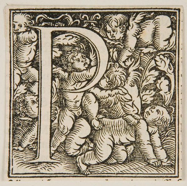
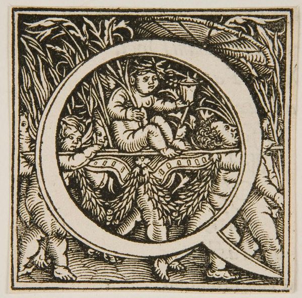
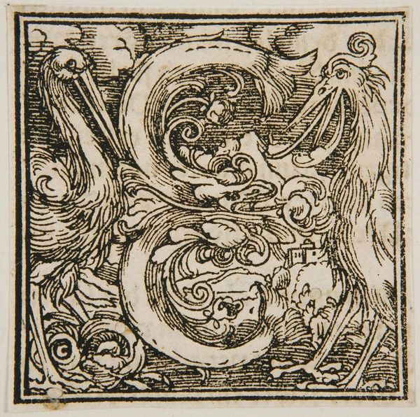
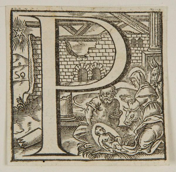
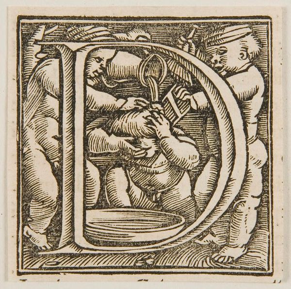
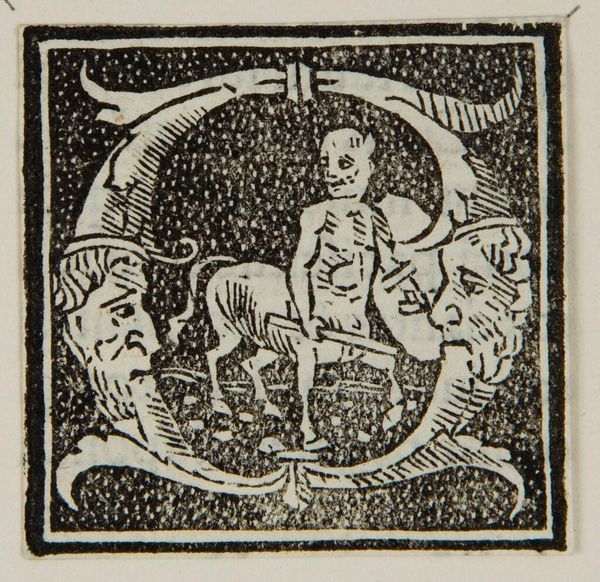
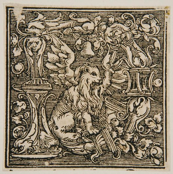
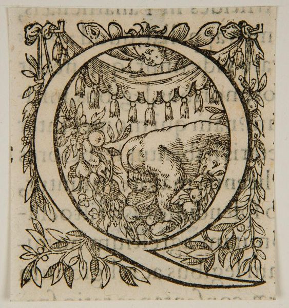
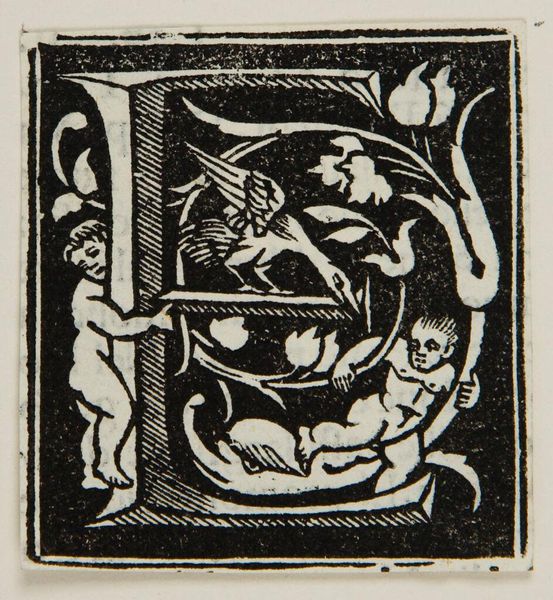
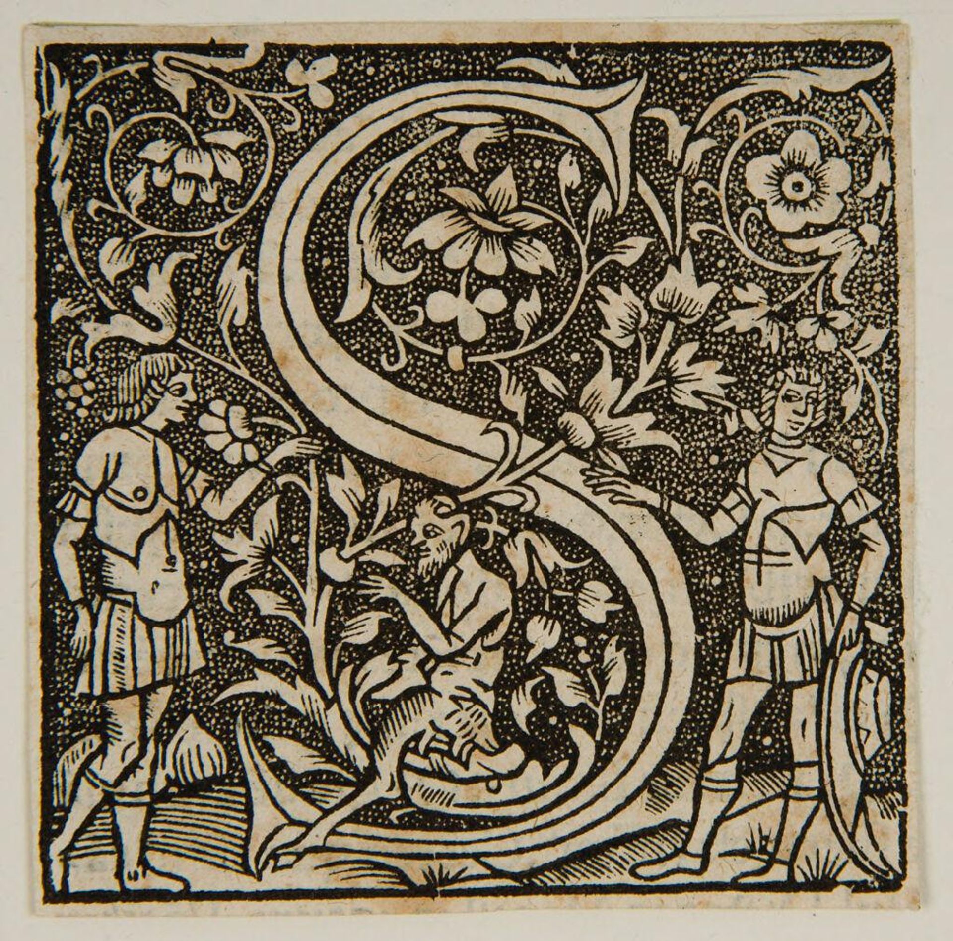
Curator: Here we have an initial, "Letter S," one of many such decorative elements created by anonymous artists. Editor: What strikes me is the playful contrast of the solid, clean lines of the letterform itself against the busy texture of the background. Curator: These illuminated letters often appeared at the start of chapters, signaling new beginnings and important content, but their visual complexity also served as status symbols. Editor: Yes, and look at the figures—classical, but rendered with such a distinctive, almost folk-art sensibility. The negative space really defines the composition. Curator: That blending of the classical and the vernacular was strategic, making texts more accessible while still conveying prestige. Editor: Ultimately, the success of the piece lies in the balance of its constituent elements and the visual energy it radiates. Curator: Exactly! It's a microcosm of societal values expressed through art.
Artwork details
- Location
- Harvard Art Museums
- Copyright
- CC0 1.0
Comments
Be the first to share your thoughts about this work.
About this artwork
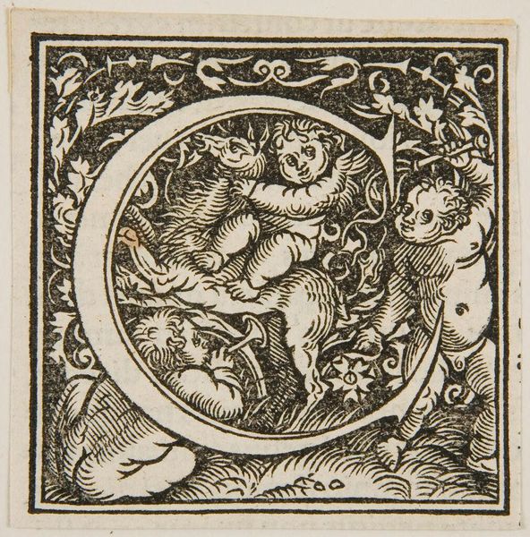
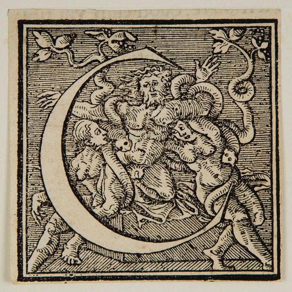
Curator: Here we have an initial, "Letter S," one of many such decorative elements created by anonymous artists. Editor: What strikes me is the playful contrast of the solid, clean lines of the letterform itself against the busy texture of the background. Curator: These illuminated letters often appeared at the start of chapters, signaling new beginnings and important content, but their visual complexity also served as status symbols. Editor: Yes, and look at the figures—classical, but rendered with such a distinctive, almost folk-art sensibility. The negative space really defines the composition. Curator: That blending of the classical and the vernacular was strategic, making texts more accessible while still conveying prestige. Editor: Ultimately, the success of the piece lies in the balance of its constituent elements and the visual energy it radiates. Curator: Exactly! It's a microcosm of societal values expressed through art.
Comments
Be the first to share your thoughts about this work.