About this artwork
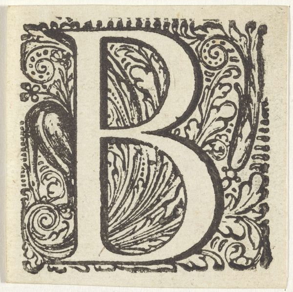
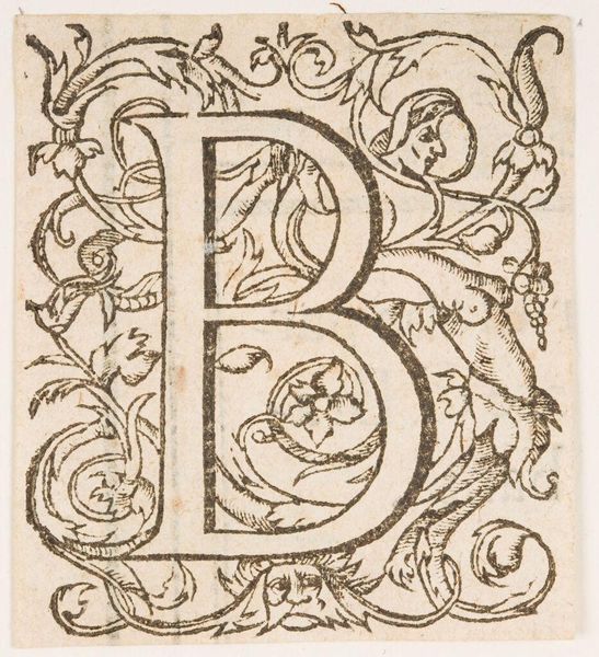
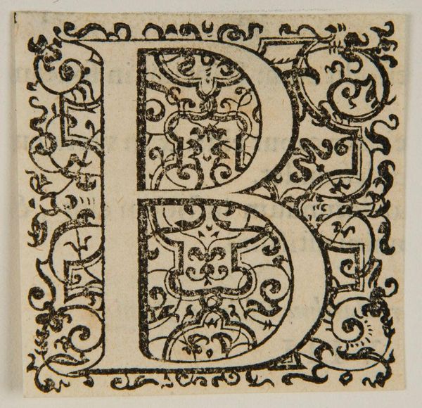
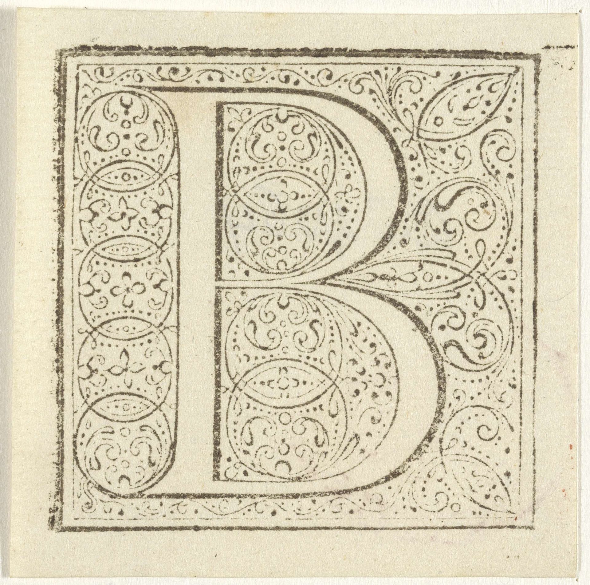
Curator: Welcome! Let’s delve into this 17th-century engraving, “Letter B in een geornamenteerde omlijsting,” created by an anonymous artist. It’s a beautiful example of decorative lettering from that era. Editor: My immediate impression is one of intricate constraint. The letter 'B' itself feels almost secondary to the explosion of tightly packed ornamentation. Curator: Indeed. Considering its historical context, initial letters like this "B" were more than just components of text. They acted as visual portals, drawing readers into illuminated manuscripts. We must consider who commissioned such work and how its reception shaped the creation. Editor: And structurally, notice the balanced tension between the bold lines of the "B" and the swirling details that inhabit its negative spaces and surround it. The pen work gives texture, an almost tactile sense of depth within a seemingly flat plane. The use of line, is key here. Curator: Absolutely. It is critical that we also consider what a single letter symbolized, a tradition we still see somewhat today in monograms and logo design. The creation of initials, for example, often catered to a male-dominated audience, further underlining a specific vision that prioritizes certain values and identities above others. Editor: I see what you mean; how might a contemporary reading shift that power dynamic, or deconstruct the assumed exclusivity? Yet it's clear from a compositional perspective that this emblem commands focus—an elegant dominance, if you will. It demands our full visual attention with every swirling motif. Curator: Certainly. By contextualizing it within sociopolitical trends, this 'B' becomes not merely a design choice, but a vehicle transmitting notions about elitism and privilege, especially if deployed within a system which excluded women and marginalized communities. Editor: That historical framing adds a powerful dimension. However, even outside these loaded contexts, there is merit appreciating how line and form operate together here: a study in calculated ornamentation. It is interesting, for me at least, that no colour distracts our eye. Curator: Of course, it invites us to dissect these visual choices. Understanding these power dynamics through intersectional lenses allows the artwork to truly speak. Thank you for taking this critical journey through "Letter B in een geornamenteerde omlijsting” with me. Editor: Likewise. It is interesting how the formal components take on new weight with context added into the mix.
Artwork details
- Medium
- drawing, graphic-art, print, ink, engraving
- Dimensions
- height 56 mm, width 56 mm
- Copyright
- Rijks Museum: Open Domain
Tags
Comments
Share your thoughts
About this artwork
Curator: Welcome! Let’s delve into this 17th-century engraving, “Letter B in een geornamenteerde omlijsting,” created by an anonymous artist. It’s a beautiful example of decorative lettering from that era. Editor: My immediate impression is one of intricate constraint. The letter 'B' itself feels almost secondary to the explosion of tightly packed ornamentation. Curator: Indeed. Considering its historical context, initial letters like this "B" were more than just components of text. They acted as visual portals, drawing readers into illuminated manuscripts. We must consider who commissioned such work and how its reception shaped the creation. Editor: And structurally, notice the balanced tension between the bold lines of the "B" and the swirling details that inhabit its negative spaces and surround it. The pen work gives texture, an almost tactile sense of depth within a seemingly flat plane. The use of line, is key here. Curator: Absolutely. It is critical that we also consider what a single letter symbolized, a tradition we still see somewhat today in monograms and logo design. The creation of initials, for example, often catered to a male-dominated audience, further underlining a specific vision that prioritizes certain values and identities above others. Editor: I see what you mean; how might a contemporary reading shift that power dynamic, or deconstruct the assumed exclusivity? Yet it's clear from a compositional perspective that this emblem commands focus—an elegant dominance, if you will. It demands our full visual attention with every swirling motif. Curator: Certainly. By contextualizing it within sociopolitical trends, this 'B' becomes not merely a design choice, but a vehicle transmitting notions about elitism and privilege, especially if deployed within a system which excluded women and marginalized communities. Editor: That historical framing adds a powerful dimension. However, even outside these loaded contexts, there is merit appreciating how line and form operate together here: a study in calculated ornamentation. It is interesting, for me at least, that no colour distracts our eye. Curator: Of course, it invites us to dissect these visual choices. Understanding these power dynamics through intersectional lenses allows the artwork to truly speak. Thank you for taking this critical journey through "Letter B in een geornamenteerde omlijsting” with me. Editor: Likewise. It is interesting how the formal components take on new weight with context added into the mix.
Comments
Share your thoughts