drawing, ink
#
drawing
#
allegory
#
baroque
#
ink painting
#
figuration
#
ink
Dimensions: 9 3/16 x 5 13/16in. (23.3 x 14.8cm)
Copyright: Public Domain
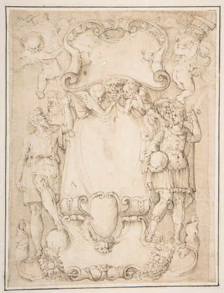
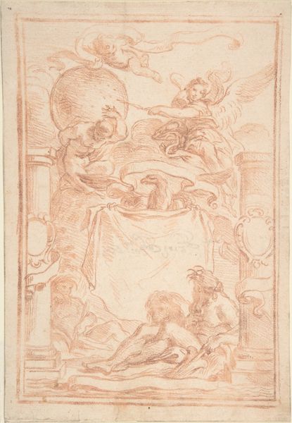
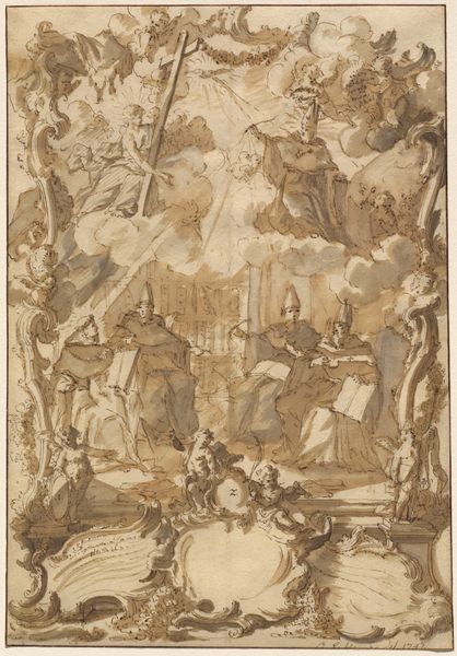
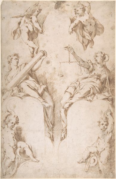
Curator: It's fascinating how the allegorical framework really communicates ideas of power and knowledge here. Editor: Power, definitely. My first impression is of incredible labor. Look at that linework – hatching, cross-hatching… it feels incredibly dense. And for a title page? Curator: Indeed. This drawing, "Design for a Title Page" by Giovanni Maria Luffoli, dates back to between 1665 and 1707. It is a baroque ink drawing. Think of it as visual rhetoric—each figure contributing to an overarching message. The figures and their attributes, drawn from classical antiquity. What kind of statement might it make, culturally? Editor: Well, from a materialist perspective, that density speaks volumes. Consider the labor of producing such a detailed piece in ink; the sheer volume of lines communicates the commitment and skill needed for production. I’m really drawn to this connection between craft and the display of intellectual ideas, which could itself be read as luxury through conspicuous and skillful work. Curator: That resonates. And, further, a book itself, beyond the symbolism on the title page, gains value and authority merely by its physical presentation; this detailed piece presents baroque ideas on the importance of classic ideals. Editor: So much of the value lies in the performance of it all – of creating these objects! Curator: Precisely! We see it here in the allegorical mode, invoking classical and learned tropes to add resonance. Editor: I agree! In viewing it through a lens of materiality and labor, there’s an interesting discussion that comes up. And there seems to be space to have these varied types of conversations on just this one image. Curator: Absolutely. This Baroque dance between image and idea offers an endless source of inspiration, it seems.
Comments
No comments
Be the first to comment and join the conversation on the ultimate creative platform.
More like this