drawing, print, ink, pen
#
drawing
#
ink drawing
#
allegory
# print
#
pen sketch
#
pencil sketch
#
etching
#
figuration
#
ink
#
pen-ink sketch
#
pen work
#
pen
#
history-painting
#
academic-art
#
italian-renaissance
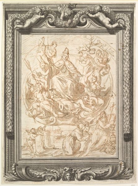
Dimensions: 10 3/8 x 7 5/16 in. (26.4 x 18.6 cm)
Copyright: Public Domain
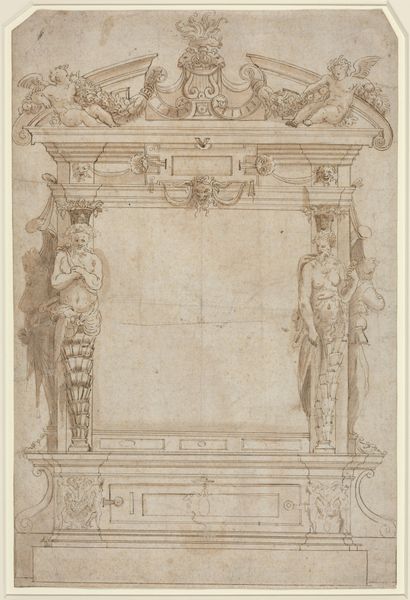
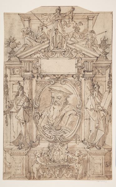
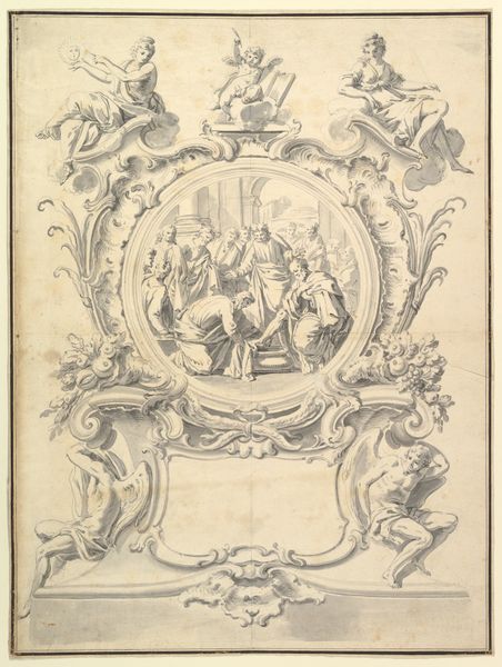
Editor: Here we have an ink drawing titled "Design for a Title Page" from around 1550-1599, by an anonymous artist. The rendering has such clarity of line and shape that it seems almost hyper-realistic. It also reminds me a bit of old architectural blueprints. How do you read this image? Curator: The key here lies in understanding its intended function. It is indeed a "design," pregnant with symbolic and allegorical elements meant to frame and enhance the book it would preface. Notice how the classical figures at the top seem to be whispering holy secrets, under the all seeing-eye which could represent a source of revelation. Editor: I do. Those figures on the side look almost like Moses carrying stone tablets. But who are all the seated people gathered below? Curator: Consider how frequently Renaissance art intertwined classical mythology and religious symbolism. Those figures resemble a gathering of the Christian curch, overseen by a dove and figures of the Old Testament on either side. They point towards the deep cultural roots on which Western identity had been built. Now, reflect on the Renaissance concept of Humanism, and what cultural anxieties are invoked by such references. Editor: So, the visual program reinforces a continuous tradition...the book’s ideas rooted in both antiquity and Christian thought, lending it authority and weight. The symbolism really becomes the message itself, connecting the book's content to a broader historical narrative. Curator: Precisely. By decoding this visual language, we gain insight into not just the book, but the values and beliefs it represents and to which it appeals. It becomes a cultural artifact as much as a design element. Editor: I hadn't considered it in terms of visual language with a cultural weight, rather than as just ornamentation. Thanks, I will definitely see title pages with fresh eyes now.
Comments
No comments
Be the first to comment and join the conversation on the ultimate creative platform.
More like this