print, paper, typography, woodcut
# print
#
paper
#
typography
#
woodcut
#
northern-renaissance
Dimensions: height 9 cm, width 13.5 cm
Copyright: Rijks Museum: Open Domain
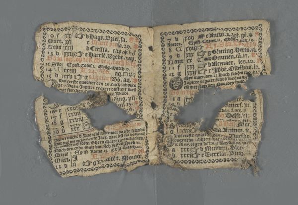
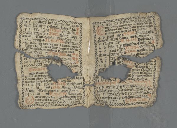
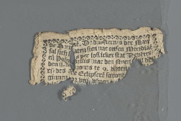
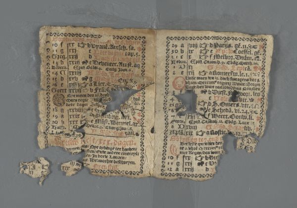
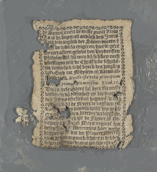
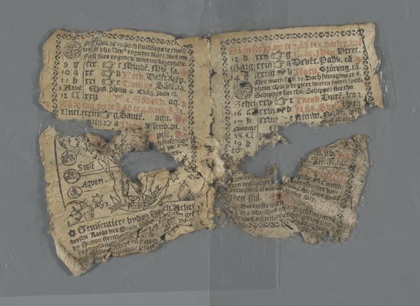
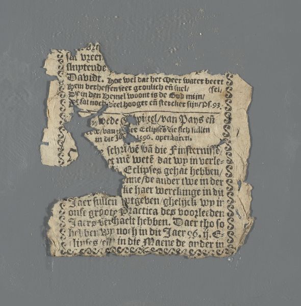
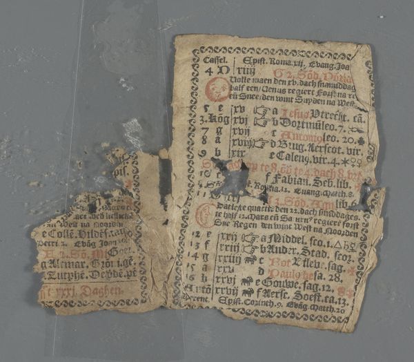
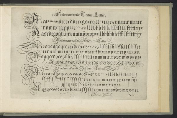
Curator: This fragmented print is titled "Bladzijde uit een Deventer almanak voor het schrikkeljaar 1596," or "Page from a Deventer Almanac for the Leap Year 1596," and is part of the Rijksmuseum collection. It’s a woodcut on paper, typical of the Northern Renaissance. Editor: My initial impression is one of fragility and decay. The tears and missing pieces give it a relic-like quality, as though it’s a surviving fragment of a lost world. The typography, though dense, is beautifully rendered, adding to the sense of delicate craftsmanship. Curator: Absolutely. These almanacs were hugely significant. Beyond simply marking time, they served as crucial sources of information, embedding societal values and disseminating knowledge through accessible, vernacular texts. Almanacs served the needs of a rising merchant class with calendrical, astrological, agricultural, and medical information, but the reality is they would have shaped cultural perceptions in profound ways. Editor: The density of the text is striking. Look at how tightly packed the lines are. It almost feels claustrophobic, yet the careful layout ensures legibility, demonstrating a masterful command of design and composition. It gives a sense of how time may have been perceived. It becomes a commodity, and thus needs to be segmented as clearly as possible to aid the readers' usage. Curator: Precisely! And consider the social implications. The printing press made information more accessible, democratizing knowledge. While literacy rates were still relatively low, the accessibility of texts like these marked a shift in power dynamics. This page provides invaluable clues about the world for which it was produced. The context reveals its historical worth, not to mention its function to empower ordinary citizens with timely insights. Editor: Beyond the text itself, consider the black and white contrast. It creates a strong visual impact, emphasizing the linear quality of the design. The use of repeated patterns along the border offers a subtle yet pleasing visual rhythm. The imperfections and damages only add to its aesthetic appeal, because that visual break complements what the text tries to communicate—there is only ever a damaged transmission. Curator: Indeed, what we observe now allows us to consider how these prints shaped the public consciousness during a pivotal period of social, religious, and economic change. Editor: Its distressed condition paradoxically enriches our appreciation, reminding us of the ravages of time, while paradoxically preserving the intent of the creator, the handcraft, and the texture from that precise period.
Comments
No comments
Be the first to comment and join the conversation on the ultimate creative platform.
More like this