Copyright: Public domain
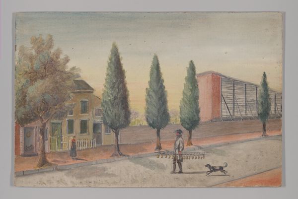
Editor: This is "Street in Krutogorsk," painted in 1914 by Boris Kustodiev, using watercolor. It depicts a vibrant, bustling town street, almost like a stage set. The colours are very striking – a medley of browns, blues, greens and reds. How do you approach a painting like this from a formalist perspective? Curator: Initially, I'm drawn to the artist's use of spatial organization. Kustodiev creates a layered composition through the distinct foreground, middle ground, and background. Notice the flatness of the picture plane. The forms are clearly delineated. How do you respond to the drawing style? Editor: The style is indeed flat and somehow naive, as in “primitive”, especially in the human figures, but that's what gives it that theatrical charm, like a storybook illustration. Does that suggest a specific artistic choice to you, looking at it from your angle? Curator: Precisely. Consider the rhythm established by the repetition of architectural forms and linear elements like the fences, figures, and branches. Also, look closely at the chromatic relationships. The harmony achieved by these cool and warm colour relationships lends a visual depth to the composition that contrasts the somewhat schematic application of drawing. Do you notice that the perspective is achieved with colour, rather than lines? Editor: Yes, the subtle variations in color are what suggest depth. It is interesting how you focus on the form, colour relationships and structural rhythm of the image, setting aside all biographical or social context to appreciate what it shows visually. Curator: Precisely. The value of this work resides within the piece itself – its ability to visually stimulate and create harmony, not necessarily what surrounds its creation. Editor: Thank you! I learned so much, particularly in realizing that an art piece must primarily be visually engaging to the viewer.
Comments
No comments
Be the first to comment and join the conversation on the ultimate creative platform.
More like this