print, engraving
#
script typography
#
baroque
# print
#
old engraving style
#
hand drawn type
#
hand-drawn typeface
#
stylized text
#
thick font
#
pen work
#
history-painting
#
handwritten font
#
engraving
#
historical font
#
columned text
#
calligraphy
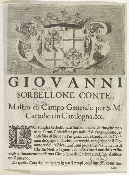
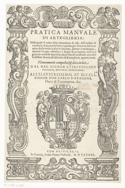
Dimensions: height 210 mm, width 156 mm
Copyright: Rijks Museum: Open Domain
Curator: The composition certainly has a visual density doesn't it? Look at how tightly packed the imagery is, practically bursting out of the frame. Editor: Indeed. We are viewing an engraving from the 17th century titled "Wapenschild van Guido Villa, markies en generaal van Savoye," attributed to Giovanni Georgi. It's essentially a printed armorial warrant, but it also projects authority. Curator: Absolutely. The Baroque sensibility is unmistakable. The complex interplay between text and image—observe the columned text blocks and that beautifully rendered initial “L” intertwined with foliage—reveals a deliberate and ornate design strategy. Editor: That’s right. Think of this image in its historical context. Guido Villa was a Marquis and General serving Savoy. This wasn't merely decoration, but a calculated display of power and lineage intended to bolster his reputation in the competitive theater of 17th-century European politics. Curator: I am fascinated by the contrast in textures, particularly the smooth, reflective sheen implied by the armor against the coarser depictions of cannon and weapons. Semiotically, this could point to the different aspects of Villa's power - defense versus offense perhaps. Editor: Yes, it reflects how identity was meticulously crafted and disseminated through prints, and these would have circulated amongst other elites solidifying alliances. The image is a crucial element in that communication, it's not just aesthetically pleasing, but strategically communicative. Curator: Looking closely at the font styles used for 'GVIDO VILLA MARCHESE' and the running text below, reveals subtle hierarchies. It makes the main message pop and establishes the social pecking order between the patron and reader. Editor: These details absolutely showcase the period’s reliance on visual propaganda, carefully controlling how a noble family like Villa wished to be perceived, cementing their place in history and exerting social influence at the time. Curator: After looking at this piece, I better grasp how the image's structure affects its overall reception, transcending the purely representative elements. Editor: And for me, its importance rests on it providing direct insight into how early modern elites used images for solidifying and promoting political messaging within society.
Comments
No comments
Be the first to comment and join the conversation on the ultimate creative platform.
More like this