print, paper
# print
#
paper
Copyright: Rijks Museum: Open Domain
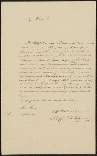
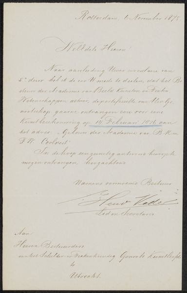
Curator: Editor: This is a printed invitation, “Brief aan Jacob Jan van der Maaten,” by Petrus Johannes Schotel, likely from 1852. It's a piece of paper, of course, but it strikes me as very formal. What visual elements stand out to you? Editor: Well, I notice the dominance of text and its arrangement. How would you analyze its design choices? Curator: Indeed. This piece invites a formalist reading focusing on typographic choices. Consider the hierarchy established through varying font sizes and styles. The title employs a larger, decorative script, immediately signaling its importance. Then examine the texture created by the dense blocks of text. Do you find any repetition or patterns within these printed lines? Editor: I see what you mean. The repeating loops in the script and the uniform spacing of the paragraphs give a structured feel. Almost like architectural support? Curator: Precisely! Think of the deliberate interplay between the filled space of the letters and the negative space surrounding them. It’s through these formal relationships that we can understand how this print communicates. Consider too, the signatures at the bottom - adding a personal, human touch. Do you think the type evokes a specific time period, before knowing the year it was printed? Editor: That's fascinating. I hadn't considered the letters themselves as elements to be "read" so thoroughly. I was more focused on the information. It's really a testament to how much can be communicated through form. Curator: Precisely! Form informs content. Analyzing the structure allows a much deeper appreciation. This process encourages us to examine all elements and explore an understanding of an era!
Comments
No comments
Be the first to comment and join the conversation on the ultimate creative platform.
More like this