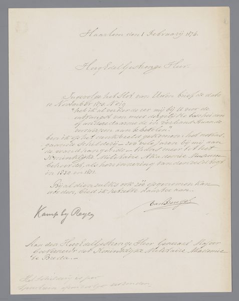
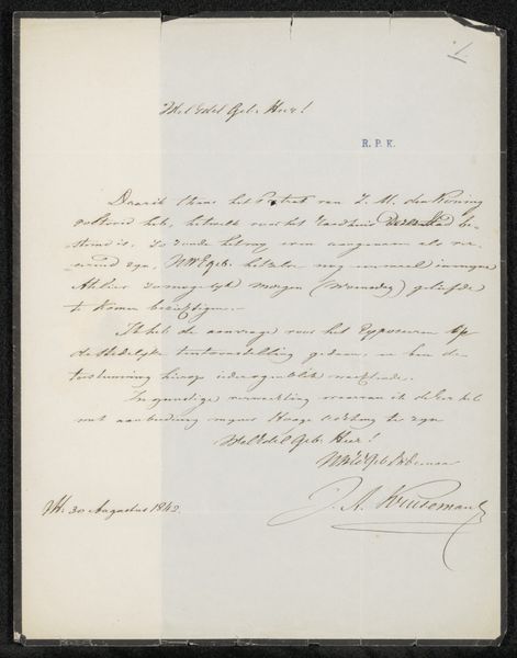
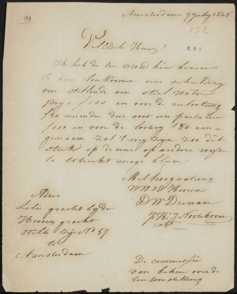
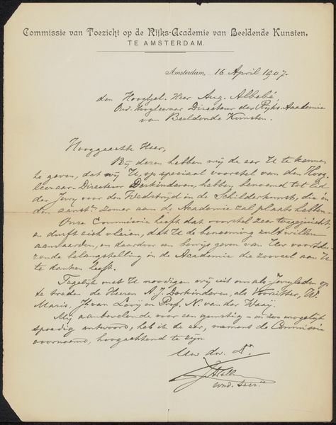
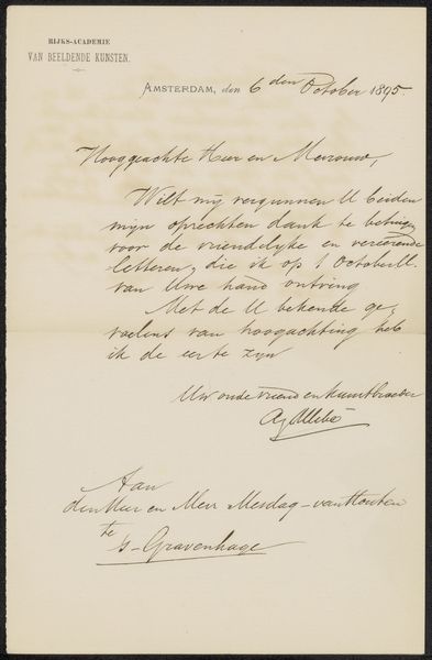
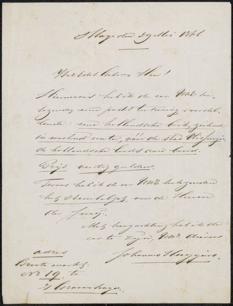
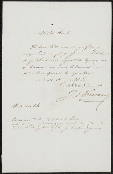
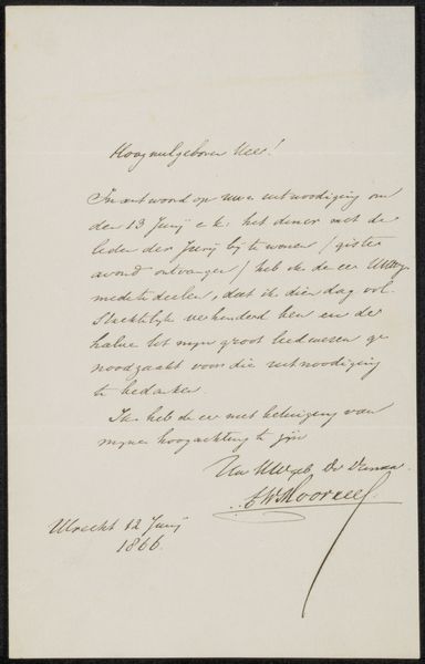
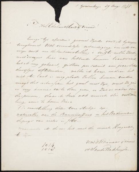
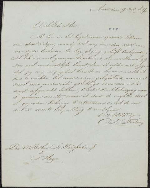
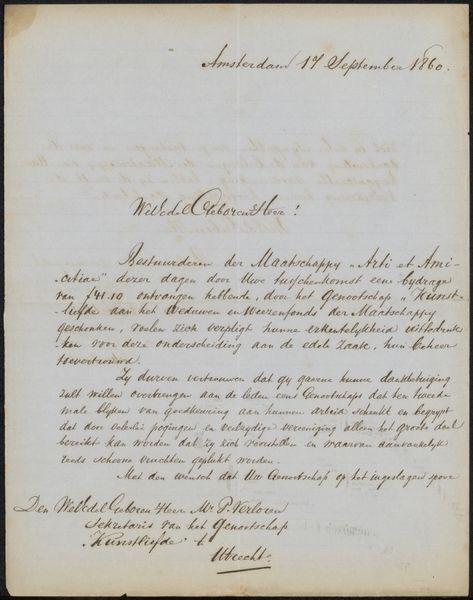
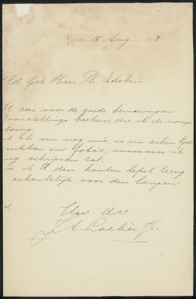
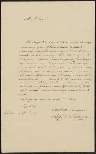
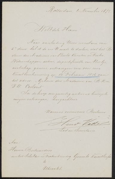
paper, typography
#
paper
#
typography
#
calligraphy
Copyright: Rijks Museum: Open Domain
Curator: This work, “Invitation to Philip Zilcken,” possibly from 1905, by G.M. Hansen, intrigues with its dedication to typography and paper. Editor: Yes, the entire piece seems composed with delicate penmanship. It creates a sense of intimate formality. It makes me wonder about the relationship between the writer and the addressee, which must have been important, as it even employs calligraphy. What do you make of the form itself? Curator: The calligraphy and typography become the primary focus. The script, the spacing, and the arrangement of the text—they form the visual content. Consider how the eye moves across the page, guided by the varying line weights and the flourish of certain characters. Do you observe any dominant visual elements, disregarding the meaning of the words? Editor: The balance and symmetry is visually interesting. It seems classical in its composition but I also notice that it is very subtle, almost like the message blends in rather than popping off of the paper. Is there a purpose for this kind of choice in invitations? Curator: The subtlety you perceive underscores the formality. This careful, considered application speaks volumes. The act of reading and deciphering the beautiful pen strokes becomes an intimate experience. Do you appreciate the materiality of the work, its texture? Editor: I didn’t really focus on that. So, is the meaning behind an art object such as this derived not just from what it depicts or explicitly states but also from how it’s presented as an object? Curator: Precisely. In many formalist approaches, meaning resides in the structural relationships. Form precedes content. Reflecting on the presentation is key, in all that is written. Editor: This helps see more in typography.
Comments
No comments
Be the first to comment and join the conversation on the ultimate creative platform.
More like this