Copyright: Public domain
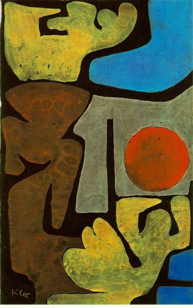
Editor: Here we have Paul Klee's "Untitled (Still Life)" from 1940, an intriguing mixed-media piece using oil paint. The stark black background makes the objects appear to float, almost like characters on a stage. I'm particularly drawn to the varied textures, and curious about the shapes he chose. What strikes you about this work? Curator: What captures my attention first is the interplay between the planar and the volumetric. Notice how Klee uses color to both define the shapes and flatten the picture plane. For instance, consider the green teapot against the orange table. Do you see how the seemingly simple forms are actually quite sophisticated in their geometric relationships? Editor: I see what you mean. The lack of traditional shading flattens the forms, but the distinct color palettes give them individual presence. What about the seemingly random markings on the orange surface - do they carry a specific meaning, or are they purely compositional elements? Curator: That is the key question, isn't it? A Formalist approach sees those markings as critical for their structural and rhythmic properties within the composition. They introduce a layer of semiotic play. Think of each mark not as a symbol *per se*, but as a unit within a visual language, contributing to the painting's overall syntax. Consider the balance of dark versus light, and how that also contributes to an emotive response. Editor: So, it's less about a literal translation and more about how those elements work together to create a visual structure and an emotional response. I'm starting to see how the naivety complements its modernism. Curator: Precisely! Klee's masterful control over these elements transcends simple representation. A close inspection demonstrates that an internal consistency and structure offers a compelling insight into his art. Editor: That's a fantastic way to see it; thank you!
Comments
No comments
Be the first to comment and join the conversation on the ultimate creative platform.