#
pop art-esque
#
popart
#
pop art
#
animal print
#
vertical pattern
#
pop art-influence
#
pattern repetition
#
cartoon style
#
funky pattern
#
reptilian
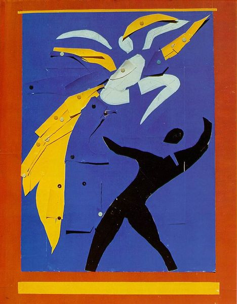
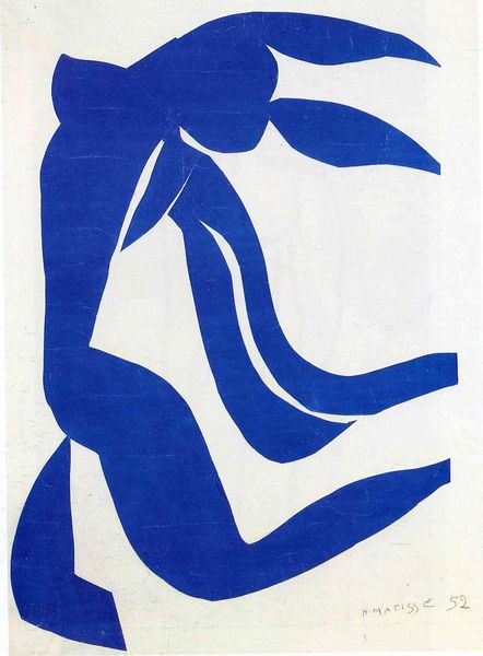
Copyright: Henri Matisse,Fair Use
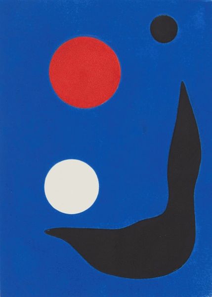
Editor: We're looking at "Icarus" by Henri Matisse, created in 1944. It's a striking piece; the sharp, angular shapes against that vibrant blue really create a feeling of tension and drama, like a moment frozen in time. How do you interpret this work, given its historical context? Curator: "Icarus", made of paper cutouts, speaks volumes about resilience during wartime. Think about 1944: amidst the backdrop of World War II, what does the myth of Icarus represent? He flew too close to the sun, yes, but isn't there also a defiance, a desire for liberation? Editor: Definitely, Icarus is a figure of ambition and perhaps foolishness, but in wartime that ambition could also represent the will to overcome oppression. Curator: Exactly. Consider Matisse's failing health during this period, he created the “cut-outs” as he was unable to paint due to surgical operations. The vibrant color and simple shapes could be a direct resistance to the darkness and constraint. How does the use of simple shapes, the red dot, the stylised 'sun', speak to you? Editor: The simplification is interesting; it makes the message very direct and accessible. It’s almost like a call to action, or at least a statement of hope, even when everything seems to be falling apart. Curator: Precisely. This piece reminds us that art doesn't exist in a vacuum. It reflects, resists, and reshapes our understanding of the world, especially during turbulent times. Editor: I see the piece very differently now. Looking at "Icarus" beyond the myth, within the context of World War II and Matisse's health struggles, gives it a whole new layer of meaning. Thank you.
Comments
No comments
Be the first to comment and join the conversation on the ultimate creative platform.
More like this