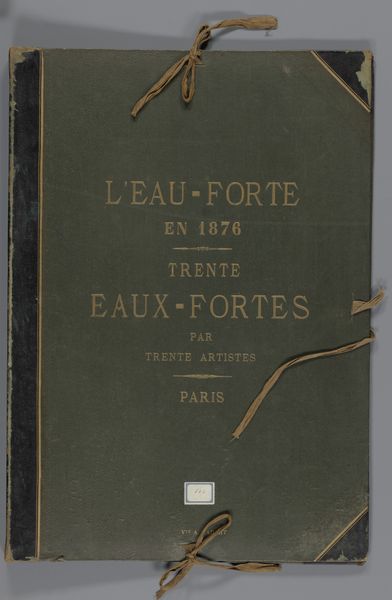
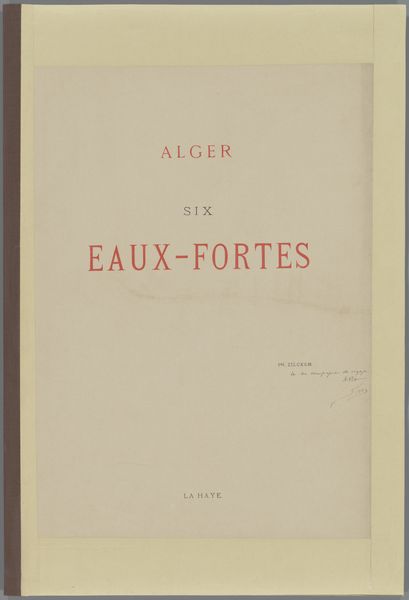
Omslag voor 32 prenten met landschappen, stadsgezichten en figuren en 8 tekstbladen 1878
0:00
0:00
weduwealfredcadart
Rijksmuseum
Dimensions: height 543 mm, width 385 mm, thickness 26 mm, width 789 mm
Copyright: Rijks Museum: Open Domain
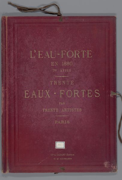
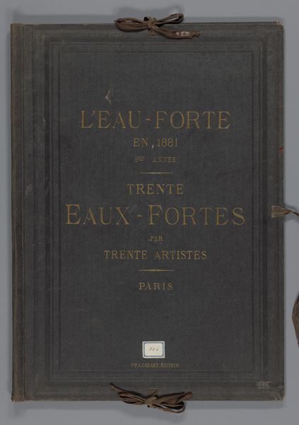
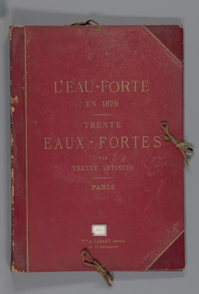
Editor: This is "Omslag voor 32 prenten met landschappen, stadsgezichten en figuren en 8 tekstbladen," or "Cover for 32 Prints with Landscapes, Cityscapes and Figures and 8 Text Pages," created in 1878 by the widow of Alfred Cadart. It's a print housed at the Rijksmuseum, combining etching and typography. It gives off such a sense of aged elegance, doesn't it? What visual elements stand out to you most prominently? Curator: Formally speaking, I am immediately drawn to the interplay between the textures. Consider the rough paper of the cover in juxtaposition with the delicate, almost shimmering, gold lettering. Observe how the typography, through its arrangement and choice of typeface, dictates the visual hierarchy of the cover. Where does your eye go first, and how does the artist guide you through the text? Editor: I initially read “L'EAU-FORTE en 1878,” because it is the largest text. Then my eye is drawn to "TRENTE EAUX-FORTES," right below it, because that line also uses the large size. Curator: Precisely. Now, consider the placement of these typographic elements within the overall composition. Note the subtle horizontal lines used to break up sections of the text. They contribute to a sense of order, contrasting with the more organic imperfections in the paper's surface. Do you notice any Art Nouveau elements here? Editor: I can definitely see some Art Nouveau in the typeface. I see the beginnings of those flowing, stylized forms that would later become such a defining characteristic. The color is so striking too. Curator: Indeed. And the ageing of the cover itself acts as an unintended element, layering time onto the intended aesthetic effect. The composition creates a balanced image through color and typeface and paper quality. I must admit I am curious what landscapes it contains within. Editor: It’s been great to analyze something that presents an excellent starting point into formal qualities to use when approaching graphic design.
Comments
No comments
Be the first to comment and join the conversation on the ultimate creative platform.
More like this