About this artwork
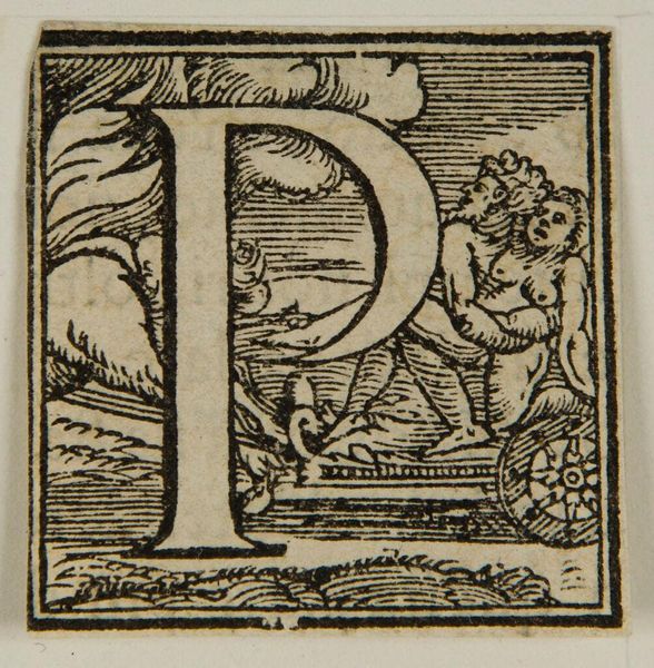
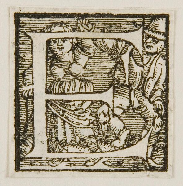
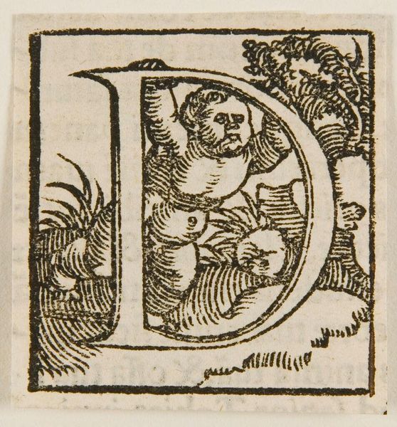
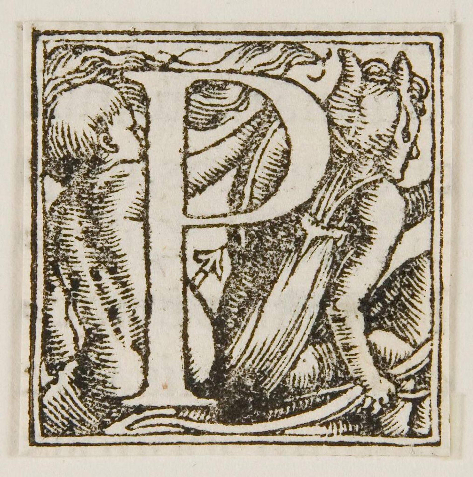
Curator: Immediately, I am drawn to the high contrast and intricate detail packed into this small space. Editor: Indeed. What we're looking at is "Letter P" by Hans Holbein the Younger, a German artist active in the 16th century. Curator: The figure on the left looks almost like a classical putto, while the one on the right seems more grotesque, perhaps even demonic. The letter "P" bisects these dueling figures. Are we meant to see the P as a dividing line between innocence and corruption? Editor: Possibly. Consider the rise of print culture at the time. Holbein was designing for a mass audience, employing established visual tropes but also subtly playing with the emerging humanism of the era. Curator: So, the letterform itself becomes a stage for these archetypal figures, each vying for our attention and allegiances. The "P" contains this conflict, this drama. Editor: Precisely. It's a fascinating glimpse into how artists negotiated tradition and novelty in early modern Europe. Curator: It speaks to the enduring power of symbols to convey complex ideas. Editor: And the political and social forces that shaped them.
Letter P c. 16th century
Artwork details
- Location
- Harvard Art Museums
- Copyright
- CC0 1.0
Comments
No comments
About this artwork
Curator: Immediately, I am drawn to the high contrast and intricate detail packed into this small space. Editor: Indeed. What we're looking at is "Letter P" by Hans Holbein the Younger, a German artist active in the 16th century. Curator: The figure on the left looks almost like a classical putto, while the one on the right seems more grotesque, perhaps even demonic. The letter "P" bisects these dueling figures. Are we meant to see the P as a dividing line between innocence and corruption? Editor: Possibly. Consider the rise of print culture at the time. Holbein was designing for a mass audience, employing established visual tropes but also subtly playing with the emerging humanism of the era. Curator: So, the letterform itself becomes a stage for these archetypal figures, each vying for our attention and allegiances. The "P" contains this conflict, this drama. Editor: Precisely. It's a fascinating glimpse into how artists negotiated tradition and novelty in early modern Europe. Curator: It speaks to the enduring power of symbols to convey complex ideas. Editor: And the political and social forces that shaped them.
Comments
No comments