Copyright: CC0 1.0
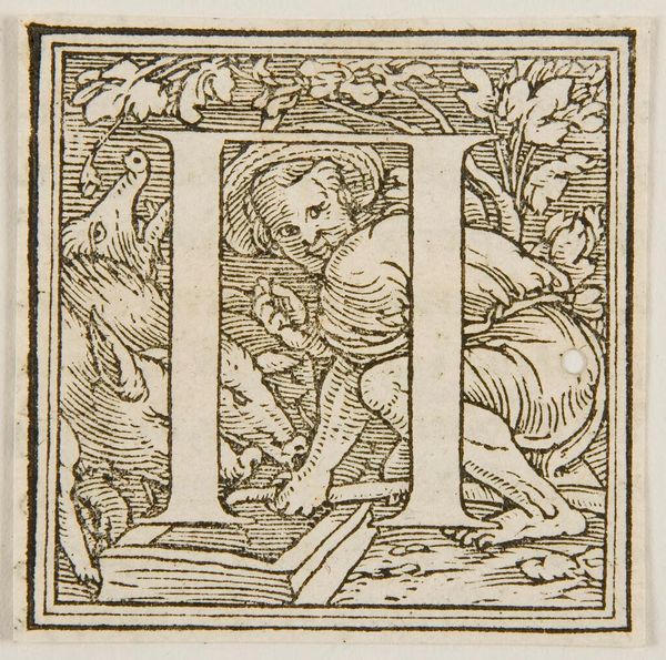
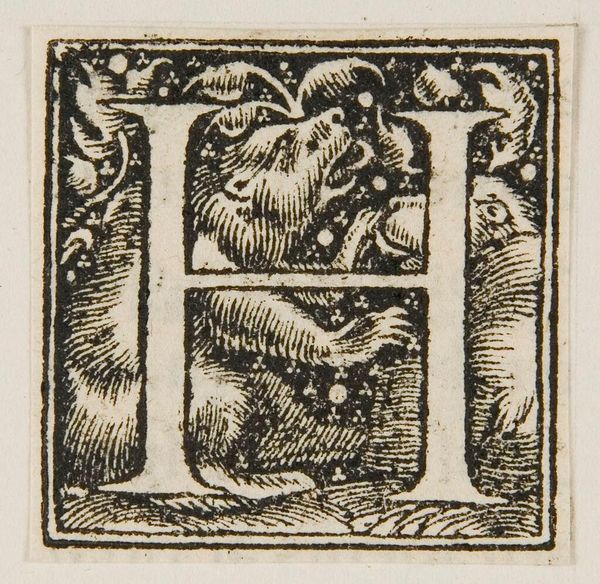
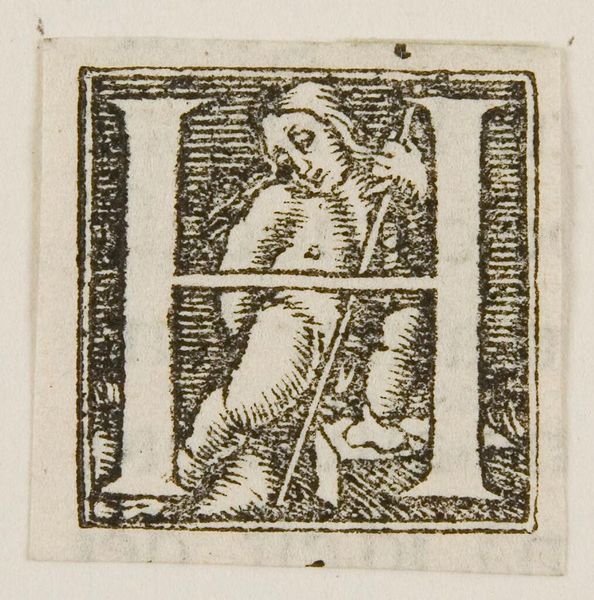
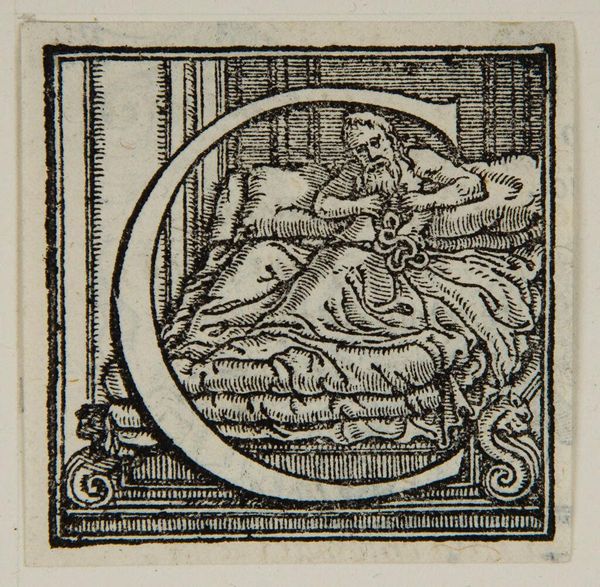
Editor: This piece, "Letter H," is by an anonymous artist. It looks like a woodcut, and it’s fascinating how they incorporated figures into the letterform. What can you tell me about it? Curator: Consider the labor involved in carving this intricate design. The choice of wood as a medium speaks to accessibility and dissemination. Note the contrast between the dense, inky lines and the negative space. How does this affect the reading of the image and the letter itself? Editor: It makes me think about the distribution of knowledge and the role of printing. It’s like art democratized. Curator: Exactly. And it bridges the gap between functional typography and artistic expression. This changes our understanding of craft, doesn't it?
Comments
No comments
Be the first to comment and join the conversation on the ultimate creative platform.
More like this