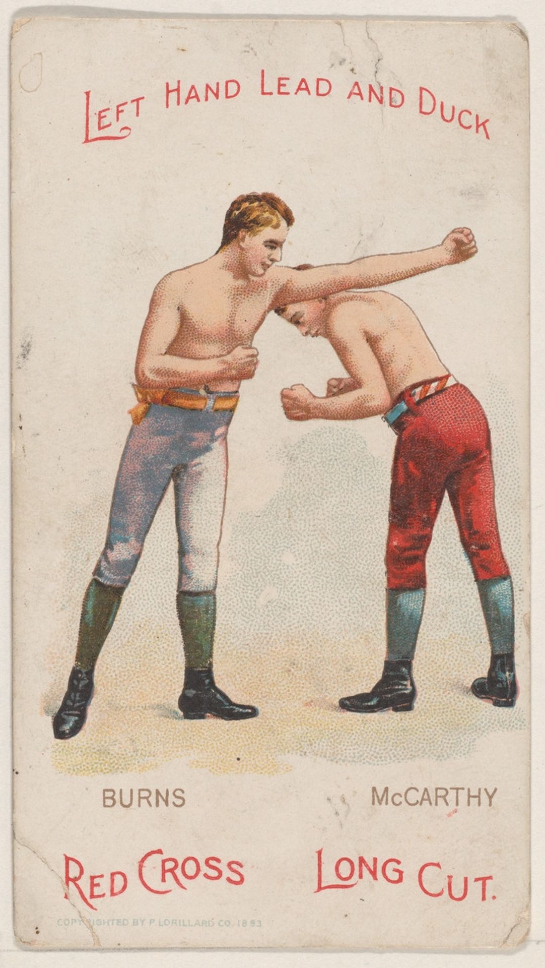
1893
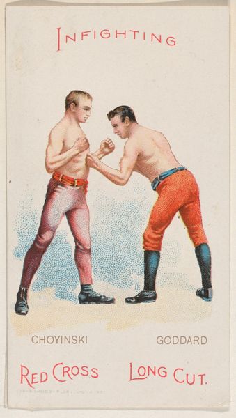
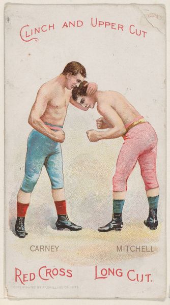
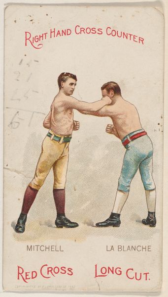
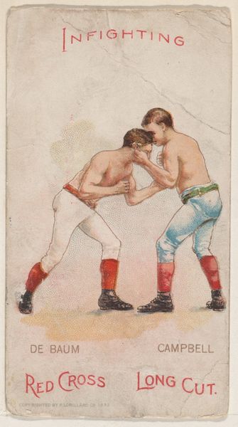
Left Hand Lead and Duck, Bobby Burns and Cal McCarthy, from the Boxing Positions and Boxers series (N266) issued by P. Lorillard Company to promote Red Cross Long Cut Tobacco
P. Lorillard Company
1760 - 2014The Metropolitan Museum of Art
Metropolitan Museum of Art, New York, NYListen to curator's interpretation
Curatorial notes
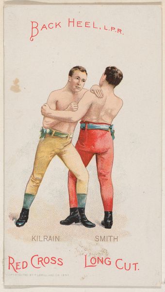
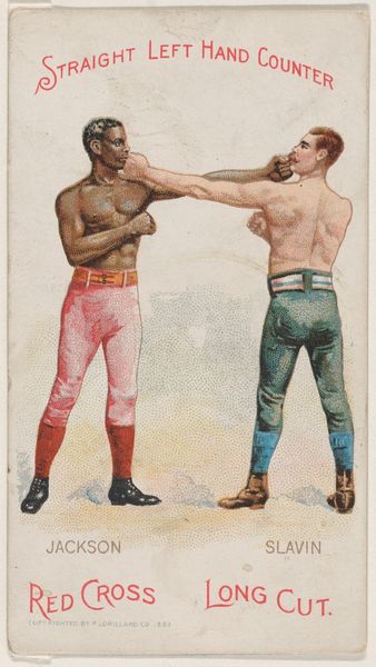
Editor: This is a colored-pencil drawing from 1893 called "Left Hand Lead and Duck, Bobby Burns and Cal McCarthy" created by P. Lorillard Company. It is part of the Boxing Positions and Boxers series and was originally an advertisement for Red Cross Long Cut Tobacco. It is quite small in scale and somewhat charmingly rendered. I’m curious about how you interpret this image. Curator: The drawing’s formal construction interests me most. Note the arrangement of the two figures, one upright and the other bent low: Burns and McCarthy create opposing diagonals, energized by color contrast—the pale trousers of the one against the reddish-orange of the other. And note the balance created: although differing, both figures wear horizontally striped waistbands and vertically oriented dark leggings that visually connect them. What function does the bright red text serve for you? Editor: It frames the central figures but I am not sure why the phrase “left hand lead and duck" is at the top. Is that a boxing move? Curator: Precisely. In semiotic terms, the title text operates as a signifier for the physical act depicted, a kind of key for interpreting the boxers' arrangement and the dynamic implied. One boxer "leads," while the other ducks away. This establishes a formal visual pattern, echoed by the graphic elements within. We can even see these echoing patterns continuing within the advertisement itself. Editor: That's interesting. I see it now. Are there any other aesthetic aspects of this drawing you find particularly relevant? Curator: Certainly, one notices how flatly the bodies are drawn; they appear two-dimensional and almost stylized. What happens if we interpret them, in terms of their flat rendering, as signifiers of commercial rather than artistic expression? Does that interpretation give you insights to how advertisements work to gain a viewer's attention? Editor: That connection hadn't occurred to me, but it is interesting how that simple change impacts our interpretation. It’s fascinating to consider the strategic choices behind what at first seemed like a simple composition. Curator: Exactly. A close analysis of the work allows for new ways to see what can get missed with the casual glance.