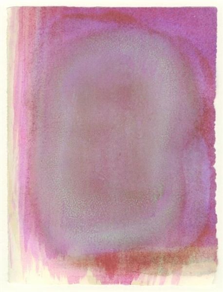
stain, print, paper, watercolor
abstract-expressionism
stain
water colours
colour-field-painting
paper
watercolor
abstraction
watercolor
Copyright: National Gallery of Art: CC0 1.0
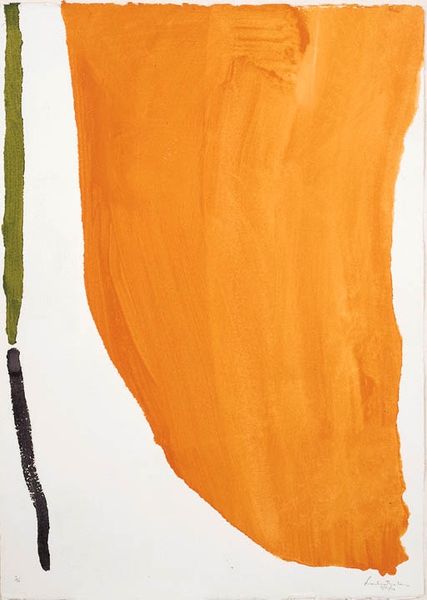
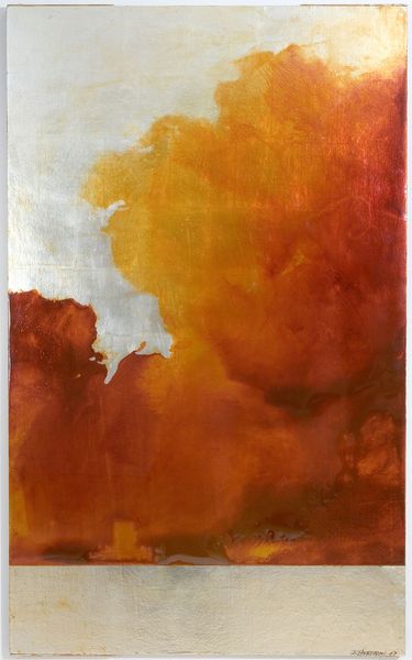
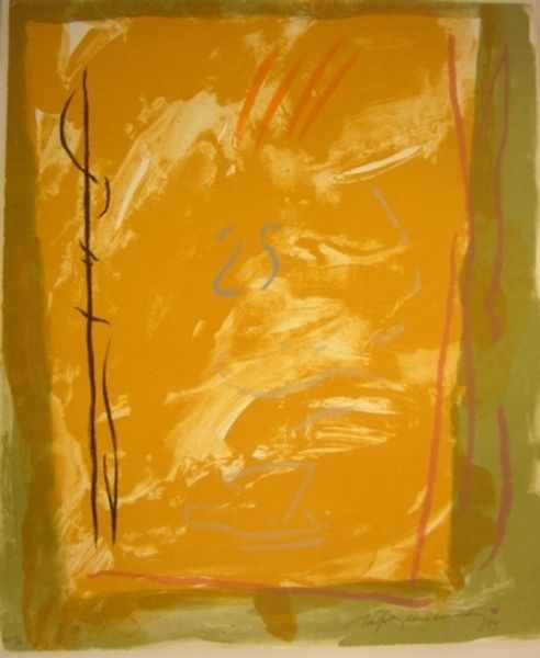
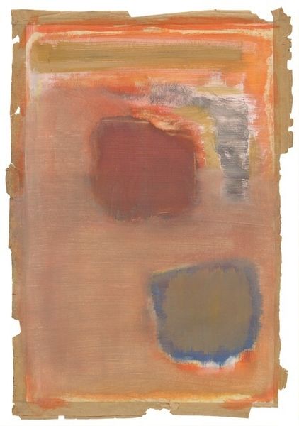
Helen Frankenthaler made this work, Orange Downpour, with paint on paper, and it feels like an experiment in letting the medium do its thing. There's a real sense of process, as if she's exploring the possibilities of color and form, rather than trying to nail down any specific image. The orange area has this fluid quality, like the paint was really thinned out, almost watery. You can see the way it bled into the paper, creating these soft, hazy edges, which really emphasizes the texture and feel of the surface. I'm drawn to the way the orange sort of pools and gathers at the bottom, heavier, denser. The contrast with the stark vertical lines on the left – one green, one black – is so interesting, creating a kind of push and pull across the surface. It feels like Frankenthaler is playing with chance and control, letting the paint flow, but also guiding it, and this reminds me a little of the way Morris Louis worked. Both artists really understood the power of color and the magic that can happen when you let the medium speak for itself.
Comments
No comments
Be the first to comment and join the conversation on the ultimate creative platform.