Dimensions: image: 450 x 685 mm support: 540 x 690 mm
Copyright: © Tacita Dean, courtesy Frith Street Gallery, London and Marian Goodman Gallery, New York/Paris | CC-BY-NC-ND 4.0 DEED, Photo: Tate
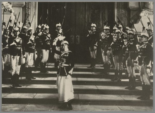
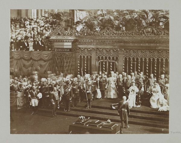
Editor: This is Tacita Dean's "Ein Sklave des Kapitals." It’s a black and white photogravure. The red flags really pop. What formal elements stand out to you? Curator: Observe how the monochromatic palette accentuates the geometric forms—the severe rectangles of the flags, the implied grid of the architecture. The subtle tonal variations grant depth, yet the surface retains flatness, drawing attention to the materiality. Does this tension between depth and surface invite further inquiry? Editor: It does! The flatness makes it feel very modern despite the old photo it references. Curator: Precisely. Note also the interplay of light and shadow, not as representational devices, but as compositional elements dictating the viewer's path. The artist manipulates these elements to disrupt traditional perspective, inviting us to reconsider the act of seeing. Editor: I see what you mean. It is more about the shapes than the people. Curator: Indeed, the human figures serve as anchoring points within this structured visual field, inviting contemplation on their placement and proportion. Editor: Thanks, I never would have looked at it that way.
Comments
http://www.tate.org.uk/art/artworks/dean-ein-sklave-des-kapitals-p20265
Join the conversation
Join millions of artists and users on Artera today and experience the ultimate creative platform.
Ein Sklave des Kapitals belongs to a portfolio of twenty black and white photogravures with etching collectively entitled The Russian Ending. The portfolio was printed by Niels Borch Jensen, Copenhagen and published by Peter Blum Editions, New York in an edition of thirty-five; Tate’s copy is the fifth of ten artist’s proofs. Each image in the portfolio is derived from a postcard collected by the artist in her visits to European flea markets. Most of the images depict accidents and disasters, both man-made and natural. Superimposed on each image are white handwritten notes in the style of film directions with instructions for lighting, sound and camera movements, suggesting that the each picture is the working note for a film. The title of the series is taken from a convention in the early years of the Danish film industry when each film was produced in two versions, one with a happy ending for the American market, the other with a tragic ending for Russian audiences. Dean’s interventions encourage viewers to formulate narratives leading up to the tragic denouements in the prints, engaging and implicating the audience in the creative process.
