About this artwork
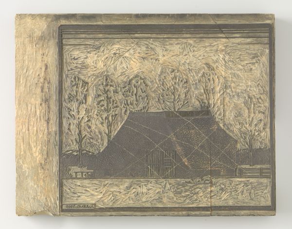
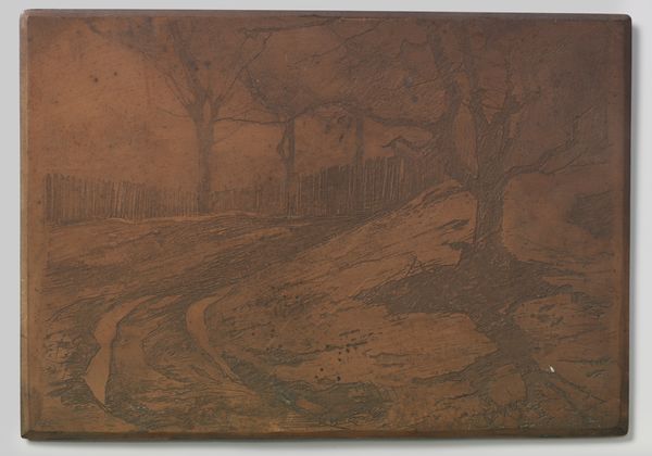
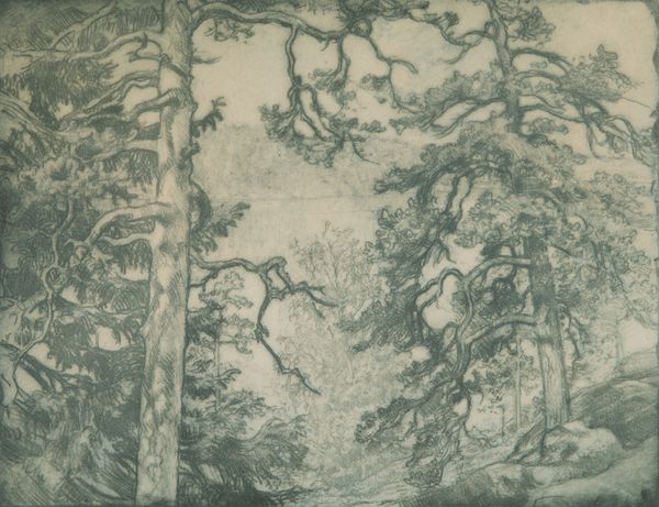
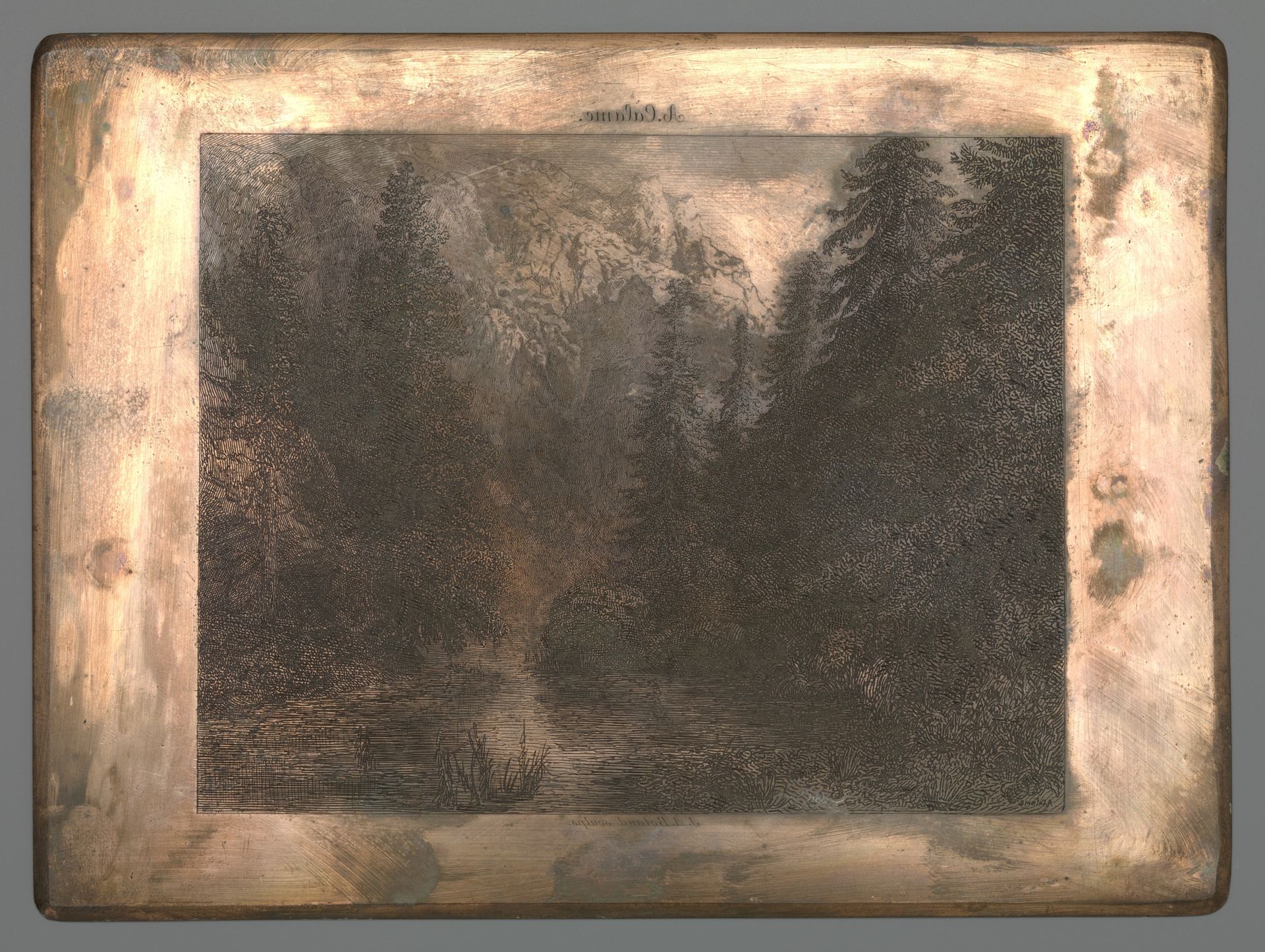
Editor: So this is "Bergrivier tussen bomen," created sometime between 1848 and 1909, attributed to Johannes Arnoldus Boland, executed in ink on paper, and it strikes me as incredibly dense and layered, especially for a landscape drawing. What formal qualities stand out to you? Curator: Indeed. The density you observe arises from Boland’s meticulous application of line and value. Observe how the composition privileges a claustrophobic depth. The interplay between light and dark, achieved solely through variations in ink density, constructs a captivating recession into the wooded space. Note how the artist limits your gaze using strategic placement of trees to manipulate depth of field and visual flow. Editor: It almost feels… suffocating? Curator: That’s an astute reading of affect, considering the means by which it is produced. The lines function as both representational tools, describing tree bark and water texture, but also as pure graphic marks whose cumulative effect produces a mood, an environment for interpretation. Ask yourself what the graphic intensity might evoke. Is it only a forest scene, or perhaps something more metaphorical? Editor: Perhaps, through this construction of such a dense and perhaps forbidding forest, he's using it to signify something else entirely, something about the self. I hadn't thought about it that way before. Thanks for opening my eyes to this new perspective! Curator: It is rewarding to explore how formal elements impact meaning. Art's essence resides not only in the subject but how the subject becomes through considered treatment of the visual.
Artwork details
- Medium
- drawing, ink
- Dimensions
- height 133 mm, width 180 mm
- Copyright
- Rijks Museum: Open Domain
Tags
Comments
Share your thoughts
About this artwork
Editor: So this is "Bergrivier tussen bomen," created sometime between 1848 and 1909, attributed to Johannes Arnoldus Boland, executed in ink on paper, and it strikes me as incredibly dense and layered, especially for a landscape drawing. What formal qualities stand out to you? Curator: Indeed. The density you observe arises from Boland’s meticulous application of line and value. Observe how the composition privileges a claustrophobic depth. The interplay between light and dark, achieved solely through variations in ink density, constructs a captivating recession into the wooded space. Note how the artist limits your gaze using strategic placement of trees to manipulate depth of field and visual flow. Editor: It almost feels… suffocating? Curator: That’s an astute reading of affect, considering the means by which it is produced. The lines function as both representational tools, describing tree bark and water texture, but also as pure graphic marks whose cumulative effect produces a mood, an environment for interpretation. Ask yourself what the graphic intensity might evoke. Is it only a forest scene, or perhaps something more metaphorical? Editor: Perhaps, through this construction of such a dense and perhaps forbidding forest, he's using it to signify something else entirely, something about the self. I hadn't thought about it that way before. Thanks for opening my eyes to this new perspective! Curator: It is rewarding to explore how formal elements impact meaning. Art's essence resides not only in the subject but how the subject becomes through considered treatment of the visual.
Comments
Share your thoughts