![1952 [Rings] by Sarah Morris](/_next/image?url=https%3A%2F%2Fd2w8kbdekdi1gv.cloudfront.net%2FeyJidWNrZXQiOiAiYXJ0ZXJhLWltYWdlcy1idWNrZXQiLCAia2V5IjogImFydHdvcmtzL2EzYmFmMmMwLTQyY2QtNDM3YS04NzcwLTllZTU3ZWJmNjkzNC9hM2JhZjJjMC00MmNkLTQzN2EtODc3MC05ZWU1N2ViZjY5MzRfZnVsbC5qcGciLCAiZWRpdHMiOiB7InJlc2l6ZSI6IHsid2lkdGgiOiAxOTIwLCAiaGVpZ2h0IjogMTkyMCwgImZpdCI6ICJpbnNpZGUifX19&w=750&q=75)
Copyright: Sarah Morris,Fair Use
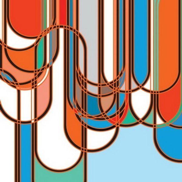
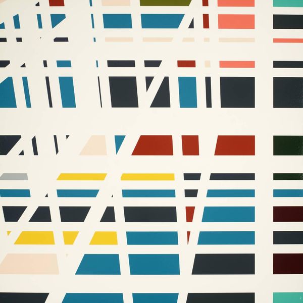
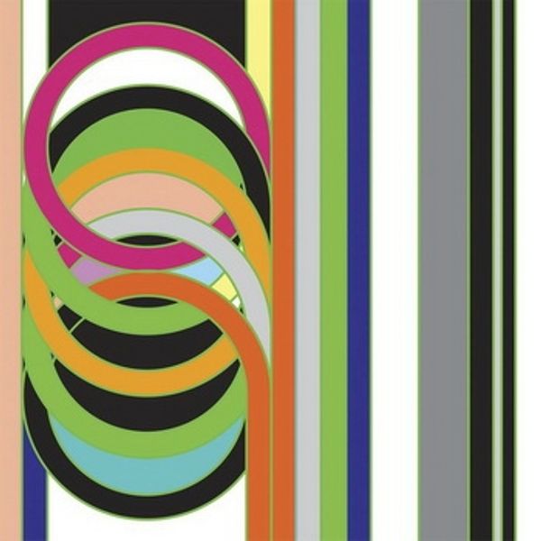
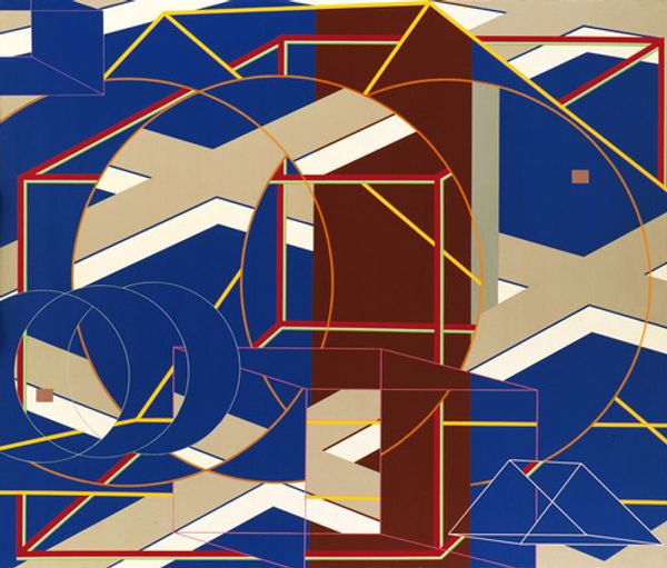
Sarah Morris made this, 1952 [Rings], using a screen printing process to achieve its hard-edged forms. Look at how she lays down the colors so flat, building the composition in layers. The painting uses a series of interlocking rings and geometric shapes, rendered in a tight palette of black, white, grey, orange, and blue. The surface looks smooth and almost mechanical. There is a particular spot where a black ring overlaps a field of white, creating a sense of depth and shadow. It’s as though the shapes are floating on top of one another. Morris's work often explores the architecture and psychology of urban spaces, and you can see echoes of that in the way she constructs this image. It reminds me a bit of Bridget Riley, with its play on visual perception and geometric abstraction, yet with a more corporate or architectural feel.
Comments
No comments
Be the first to comment and join the conversation on the ultimate creative platform.
More like this