Curatorial notes
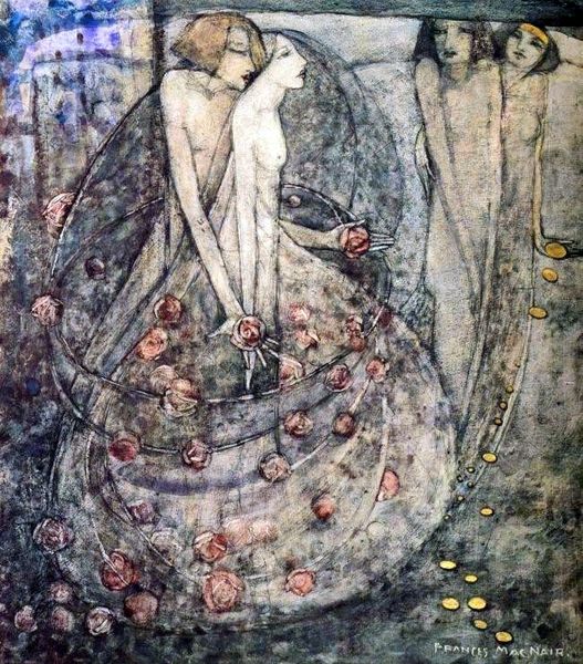
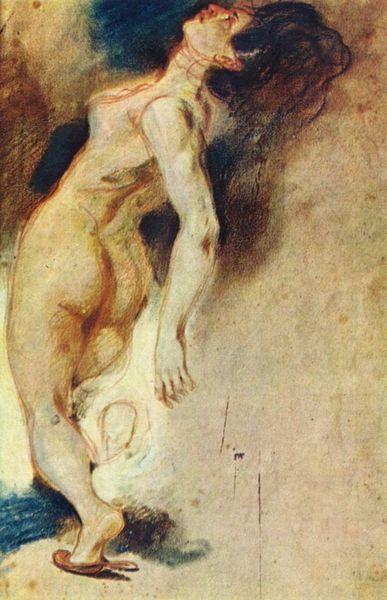
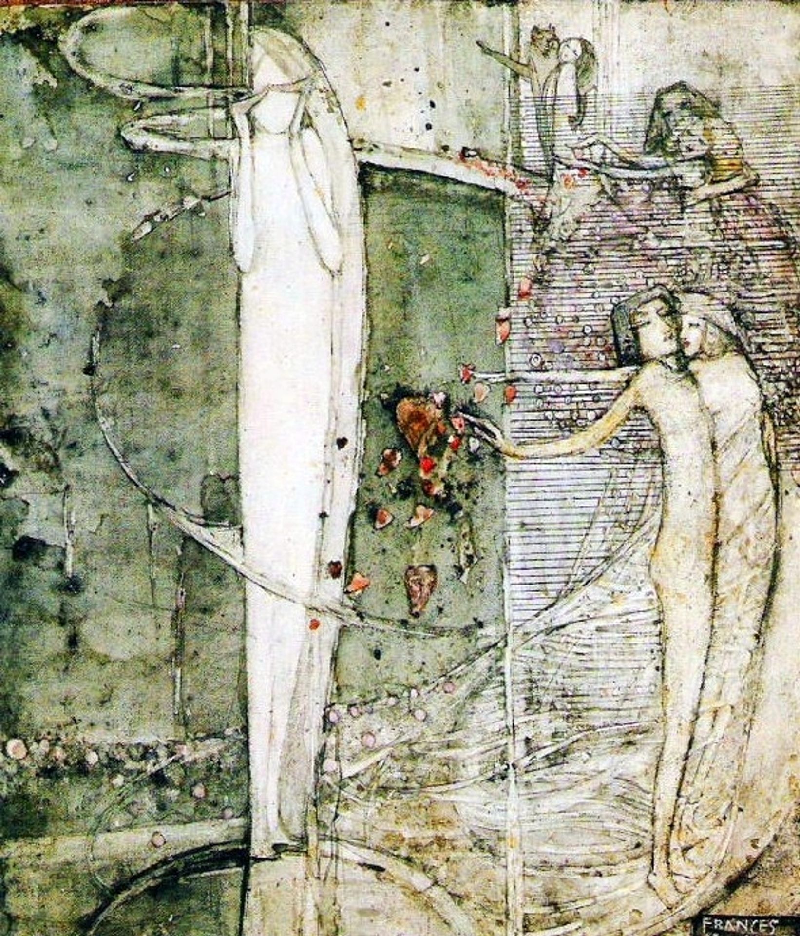
Editor: We're looking at "Sleep" by Frances Macdonald, created around 1910 using watercolor. It strikes me as dreamlike, with elongated figures and a rather muted, ethereal palette. What structural elements stand out to you in this piece? Curator: Indeed. Consider the division of the picture plane. We see a distinct separation into two zones, demarcated by shifts in texture and coloration. The stark white figure on the left contrasts strongly with the clustered figures on the right. It appears she utilized the horizontal line, both within the figure and within the geometric patterns. What of the figures themselves? Editor: The figure on the left seems solitary, almost like a column. Then the grouping on the right feels interconnected, perhaps more active? What do you make of those contrasting arrangements? Curator: Precisely. The single figure, defined by vertical lines, may evoke a sense of monumentality or isolation, while the grouping uses layered horizontal patterns. Now, observe the strategic placements of those red heart shapes throughout the composition. How might these repetitions function visually? Editor: They definitely disrupt the otherwise gentle color scheme, and guide the eye across the picture, almost like punctuation. Are they symbols within this pictorial language, a type of accentuation through their placement in proximity of a dominant figure? Curator: Very astute. The deliberate scattering of the hearts adds to a tension between serenity and unease. Macdonald’s handling of watercolor creates subtle washes that serve as contrasts, creating definition to each visual space. This juxtaposition underscores, reinforces that liminal space between conscious and unconscious states. Editor: It is like she wanted to show more through these separations. The balance between the horizontal structure, against the hearts definitely created an uneasy feeling, and using contrast brings a lot to this small watercolor work. Curator: Exactly! Recognizing how those visual contrasts, techniques, and shapes construct and enhance meaning greatly deepens our comprehension, right?