Dimensions: height 422 mm, width 301 mm
Copyright: Rijks Museum: Open Domain
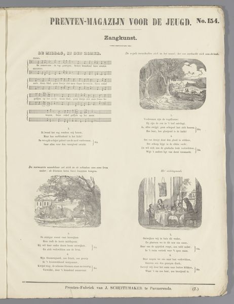
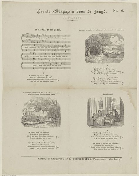
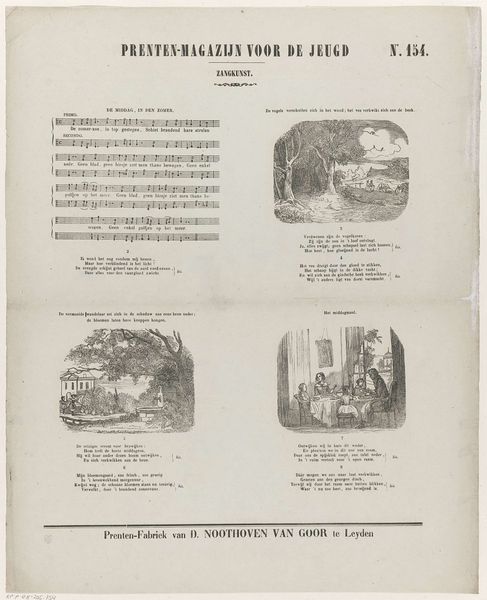
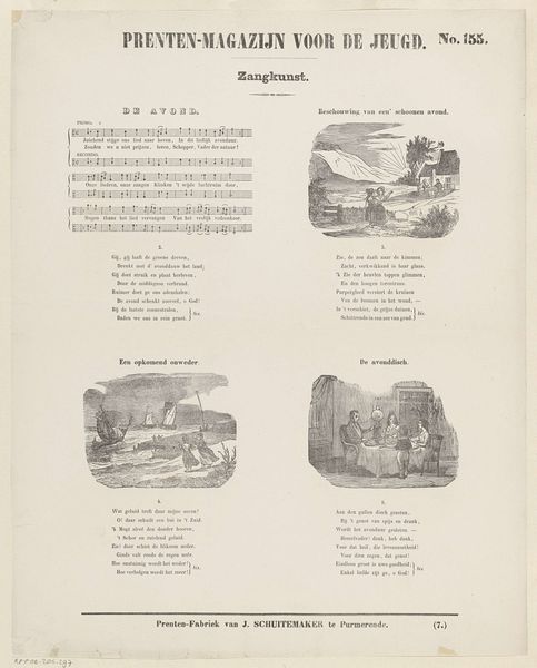
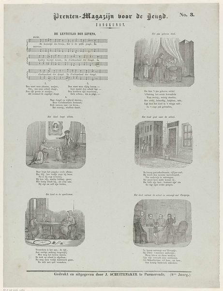
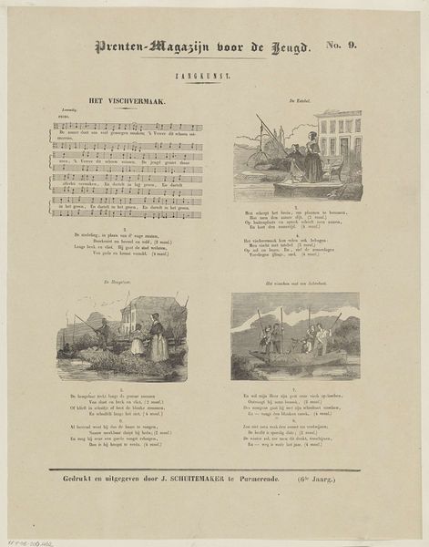
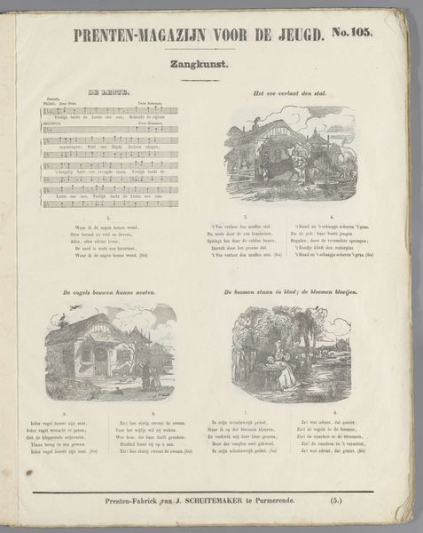
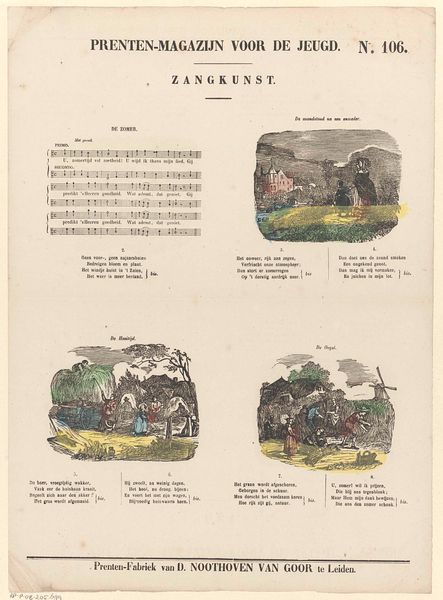
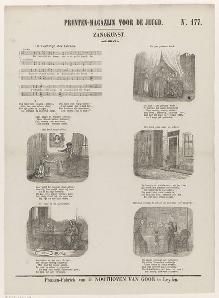
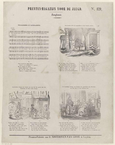
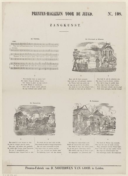
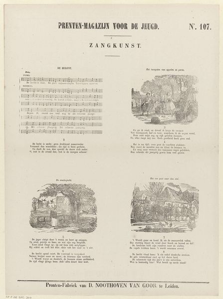
Editor: So, this is “Lente,” or “Spring,” a lithograph from sometime between 1850 and 1881 by Dirk Noothoven van Goor. It looks like it's from some kind of magazine? What catches my eye is how this piece is both visually appealing with its charming scenes but also… utilitarian? How would you interpret a work like this? Curator: Well, let's consider its original context. The title "Prenten-Magazijn voor de Jeugd" suggests this was intended for children, likely as part of an educational or recreational publication focusing on "Zangkunst," or the art of singing. These were not conceived in a vacuum; they emerge from very specific publishing ecosystems. Editor: I see, so the engravings depict springtime scenes, acting almost like illustrations for the song printed alongside? It feels a bit like a proto-music video. Curator: Exactly. It highlights the evolving relationship between visual and performing arts, and mass media. Remember that during this period, printmaking became increasingly accessible, broadening the distribution of art and ideas. Think about who could have access to those pieces: was that equally shared by all kinds of citizens, or were they exclusively intended for certain parts of society? Editor: That makes a lot of sense. Knowing that this was for children from a particular social class completely shifts my perspective. So, it’s more about the social history of art rather than just admiring it for its beauty? Curator: Both! The aesthetic choices reflect the social context, it represents more than mere pretty imagery, and by investigating its history we unveil some hidden forces in action. Editor: This has given me so much to think about concerning who art is for and the hidden messages it sends. Curator: Indeed. There is so much beyond the surface if we think critically about how the art came into being.
Comments
No comments
Be the first to comment and join the conversation on the ultimate creative platform.
More like this