drawing, graphic-art, paper, typography, ink
drawing
graphic-art
art-nouveau
paper
abstract
typography
ink
geometric
decorative-art
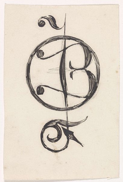
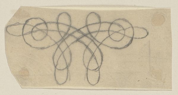
Dimensions: height 59 mm, width 81 mm
Copyright: Rijks Museum: Open Domain
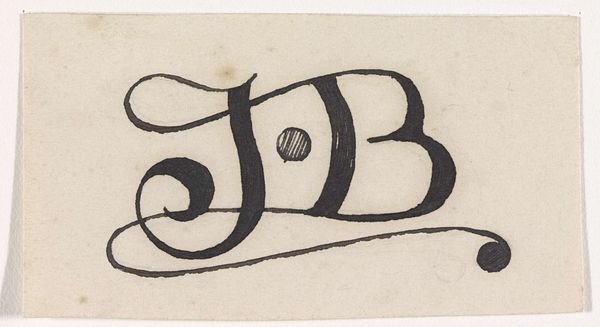
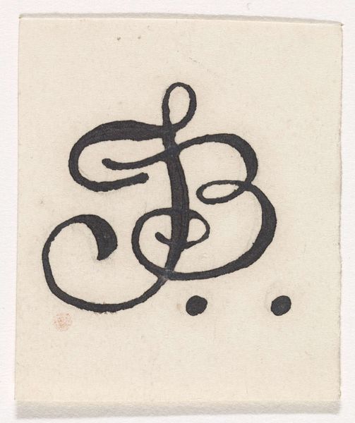
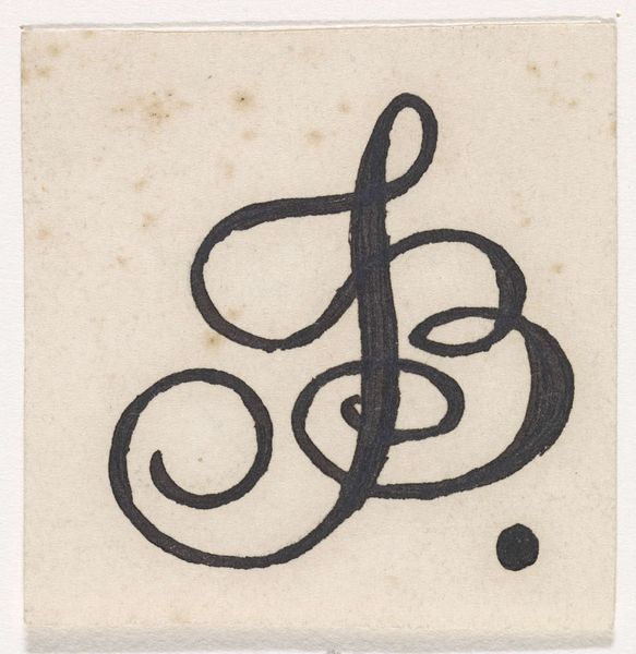
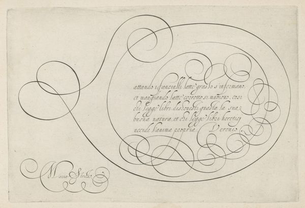
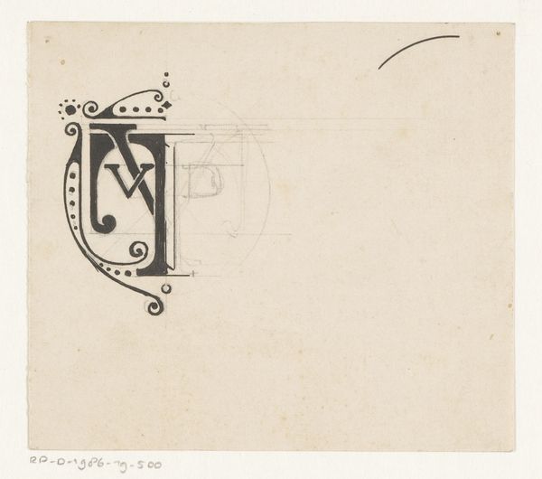
Curator: Ah, here we have “Ontwerp voor een monogram met de letters J en B,” or “Design for a monogram with the letters J and B,” by Antoon Derkinderen. It’s dated circa 1869 to 1925. Editor: It's striking how minimalist it is. Just ink on paper, but the way the lines flow—almost like a signature dance—it creates a really elegant feeling. Curator: Absolutely, and consider the historical context. This piece emerges during a period where graphic design was gaining prominence, influencing branding and personal identity in a rapidly industrializing world. These monograms were more than just decorative; they signified status and belonging. Editor: Yes, it functions as a kind of graphic heraldry. I'm drawn to the economy of the design; it’s reduced to pure, almost abstract form. Look at the thickness of the ink creating such strong contrasts. The oval itself, is that symbolic? Curator: It certainly could be, playing with ideas of wholeness and enclosure which was explored by artistic movements during that time. But more pragmatically, ovals were very fashionable framing devices in calling cards, stationary or even bookplates at the turn of the century. These forms became symbols in and of themselves of this new bourgeoise. Editor: It’s interesting to consider how these decorative motifs circulate. I mean, doesn’t this echo some art nouveau principles, like those whiplash curves? It really feels of that era, that move away from stark industrial design into a handcrafted aesthetic. Curator: It’s a complex dialogue, this tension between mass production and individual expression. Artists like Derkinderen found themselves mediating these spheres, which can be difficult in the art market today. The original function of something is only preserved when considered together with socio-economical elements in art. Editor: Well, however we read it, that cursive flourish at the bottom brings a sense of movement, even joy, to something so restrained. What I notice in particular is this focus on texture using stark geometry. Curator: It is true. These monograms are small windows into a very different world with vastly different material practices in visual media. Editor: In essence, Derkinderen transformed what might be seen as simple initials into something beautiful and conceptually layered. Curator: Indeed, an eloquent testament to the interplay of art and social identity.
Comments
No comments
Be the first to comment and join the conversation on the ultimate creative platform.