drawing, graphic-art, typography, ink
#
drawing
#
graphic-art
#
toned paper
#
art-nouveau
#
ink paper printed
#
old engraving style
#
hand drawn type
#
form
#
personal sketchbook
#
typography
#
ink
#
hand-drawn typeface
#
geometric
#
ink colored
#
symbolism
#
sketchbook drawing
#
watercolour illustration
#
sketchbook art
Dimensions: height 39 mm, width 39 mm
Copyright: Rijks Museum: Open Domain
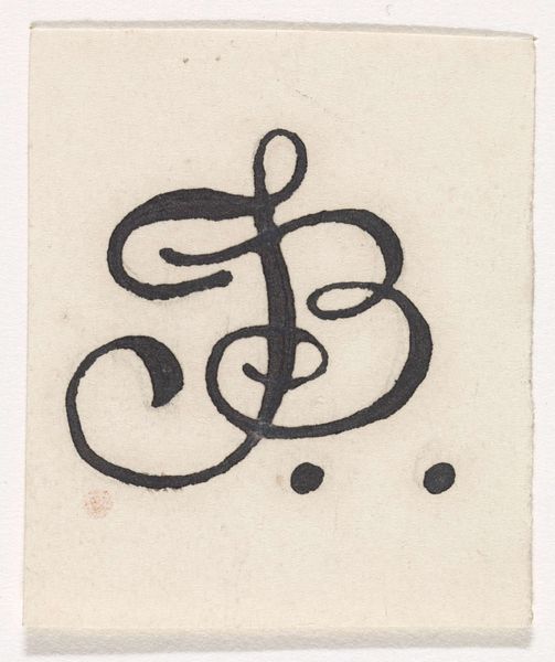
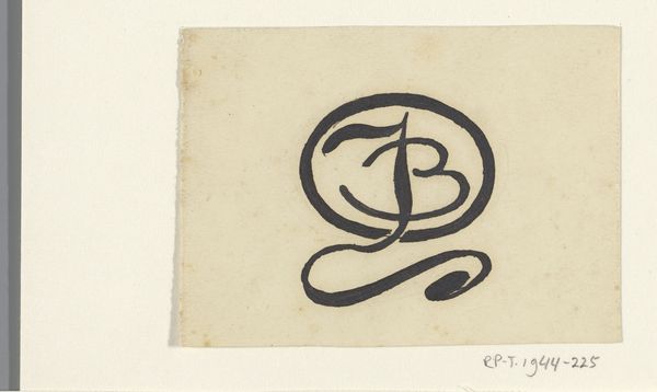
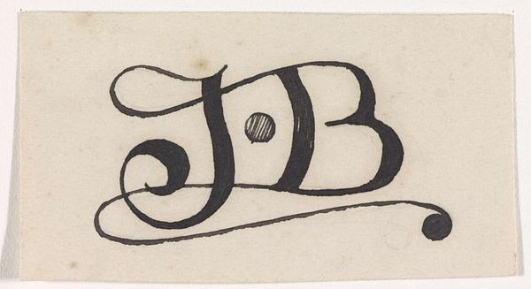
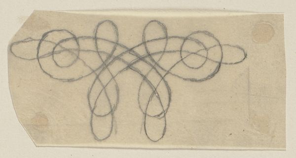
Curator: Let’s take a look at “Ontwerp voor een monogram met de letters J en B,” a design for a monogram featuring the letters J and B by Antoon Derkinderen, dating from somewhere around 1869 to 1925. It's done in ink, as a drawing, with elements of typography in a style reminiscent of Art Nouveau. What springs to mind for you? Editor: It’s like a signature waiting to happen! The flowing lines give it such personality, almost like a calligraphic dance. And I love that single dot at the bottom – is it an assertive period, or just a rogue ink drop? Curator: I like your thinking. I tend to see this period in design through a more materially focused lens, particularly how the rise of industrial printing actually elevated the status of hand-drawn elements and individual craftsmanship. The imperfections become intentional acts of resistance. Editor: A rebellion of the handmade, fighting against the machine. I get that. Knowing the time period does bring this to life a bit more. Does the Art Nouveau style influence how the piece would have been produced and received, materially? Curator: Absolutely! Art Nouveau saw a deliberate return to organic forms and meticulous handwork in response to mass-produced, standardized design. Pieces like this would have been prized not just for their visual appeal, but for showcasing skilled labor and unique design principles, influencing areas like book illustration and decorative arts. Editor: It makes you wonder about the person meant to receive this monogram. The time spent, the ink, the precise execution… it feels like an act of devotion, crafting this perfect visual shorthand. I'm drawn in by the quiet luxury of a pre-digital world. Curator: In that era, even personal identity took on this almost monumental feeling – letterheads, personalized stationery... objects signaled one's presence with more intent than an Instagram handle might today. Editor: I suppose there’s a certain irony in discussing this handmade piece on a digital audio guide today, huh? It’s still powerful, though. A looping little monument to self-expression. Curator: Indeed. A potent, handcrafted reminder of a time when even a pair of initials held weighty artistic intentions.
Comments
No comments
Be the first to comment and join the conversation on the ultimate creative platform.
More like this