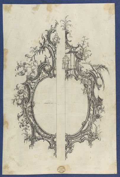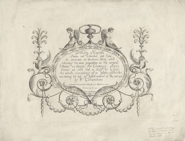
Shields for Pediments, in Chippendale Drawings, Vol. I 1754
0:00
0:00
drawing, print, pen, architecture
#
drawing
# print
#
form
#
geometric
#
15_18th-century
#
line
#
pen
#
decorative-art
#
architecture
#
rococo
Dimensions: sheet: 5 7/8 x 8 3/8 in. (14.8 x 21.3 cm)
Copyright: Public Domain
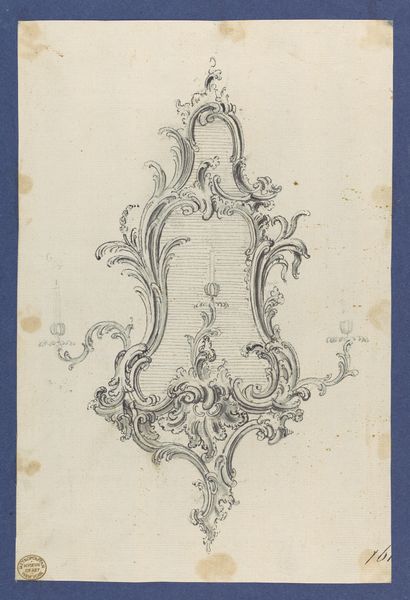
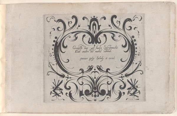
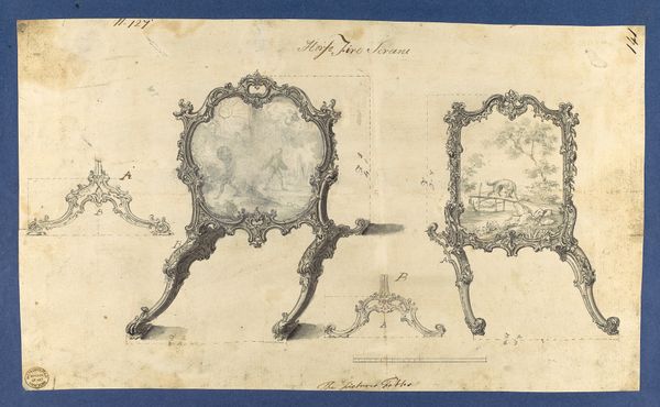
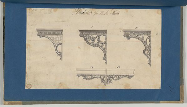
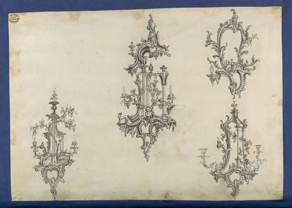
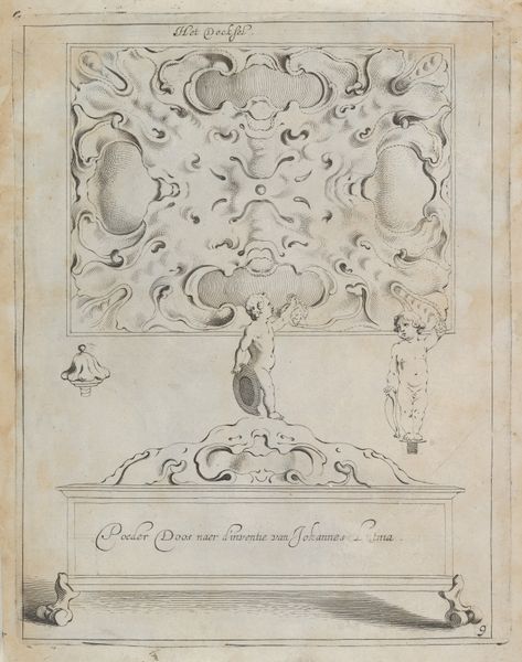
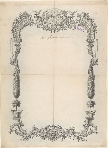
Curator: Looking at this detailed pen and print drawing titled "Shields for Pediments," created in 1754 by Thomas Chippendale, one can appreciate the intricate lines that form these decorative architectural elements. They currently reside in the Metropolitan Museum of Art. What are your first thoughts? Editor: They strike me as symbols of a bygone era, yet the design—these intertwined, almost combative swirls—feels eternally relevant. It's almost as if I'm staring into mirrors reflecting aristocracy and ornamentation, power structures built with carefully selected, yet deliberately displayed iconography. The composition has this latent visual aggression—but that probably also represents my feelings on class structures in history, though, to be fair! Curator: I can appreciate the latent visual aggression— the Rococo period was all about excess and display for specific reasons tied to class power—but I'm intrigued by the persistent use of the "shield" form. As defensive armaments, how did it signal shifting values, aesthetics, and possibly anxiety of the era? Was it nostalgia for a more hierarchical era—signaling, maybe, anxiety of a "new era" that never was, or of one on its way? Editor: Absolutely, that hits the mark. It carries weight because it draws on collective symbols; the shield is primal, linked to the struggle, and here it is almost weaponized as *ornament*. And I see other cultural connections: in heraldry, shields speak volumes about heritage. The flourishes tell stories of those in power. Do the Rococo curves soften it, mocking the older values, or just updating their language of self-presentation? I keep going back and forth about the question of *irony.* Curator: It brings to mind a sense of imposed structure and authority, rendered in these very deliberately organic shapes that fight the more severe aspects of the core shape! It raises questions about authority and how design has been deployed. Do we understand or do we interrogate it when we see these ornamental gestures of privilege? Does accessibility come from knowing more, or from resisting it—how do these gestures fit into the context of the now, where ideas like power and legacy, class, or structure, are consistently being fought. Editor: It is fascinating to observe that what began as personal protection and inherited prestige evolves into pure ornamentation—becoming almost pure communication. Peeling away those layers, looking past our current judgments to try and understand their symbols reveals what society really holds sacred, sometimes even despite itself. Curator: These visual rhetorics continue to resonate, showing us how design not only reflects society but helps construct it and challenge it too.
Comments
No comments
Be the first to comment and join the conversation on the ultimate creative platform.
