Title for the Print Series 'Grateske voer golt smeden Schrijnwerkers Ende andere des nodich hebbende' 1605 - 1615
0:00
0:00
drawing, print, engraving
#
drawing
#
baroque
# print
#
line
#
engraving
Dimensions: 7 3/4 × 11 7/16 × 1/8 in. (19.7 × 29 × 0.3 cm) Plate: 5 3/8 × 6 3/16 in. (13.7 × 15.7 cm)
Copyright: Public Domain
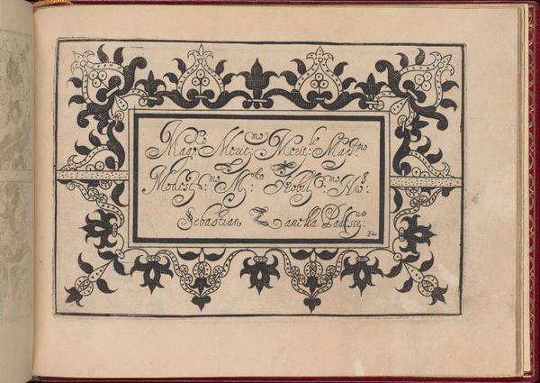
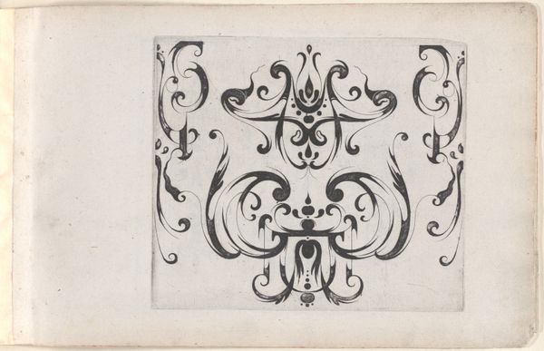
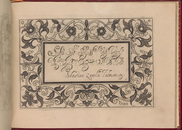
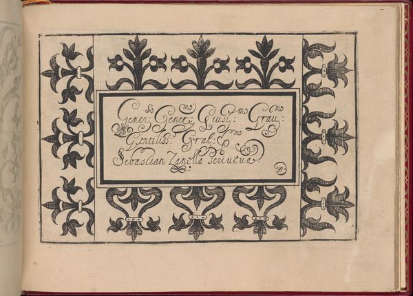
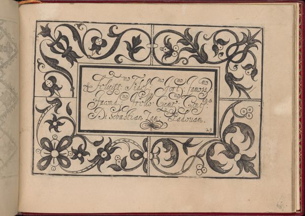
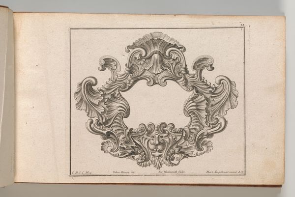
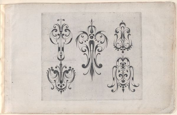
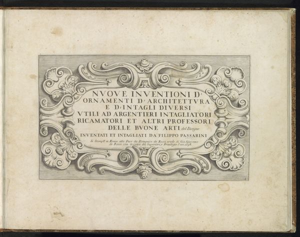
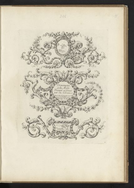
Curator: Meinert Gelijs's "Title for the Print Series 'Grateske voer golt smeden Schrijnwerkers Ende andere des nodich hebbende,'" created between 1605 and 1615, presents an intriguing example of Baroque linear engraving, currently held in the collection of the Metropolitan Museum of Art. Editor: Oh, hello there. First blush, it reminds me of wandering through a blacksmith's workshop after hours—the shadows and swirling bits of metal seem to dance on their own. Curator: Indeed. Observe the symmetry inherent in its structure. The meticulous lines, rendered through engraving, articulate a self-contained system. The central cartouche provides a visual anchor for the decorative flourishes, illustrating the relationship between textual space and ornamental dynamism. Editor: True. The flourish acts like breath, imbuing this rigid structure with a strange and captivating vivacity. It's a very disciplined liveliness. What did these blacksmiths make back then? This image is also slightly funny if they forged torture devices—though this title-page decoration suggests elegance and craft, whatever came out from it. Curator: Gelijs designed these prints to act as templates for artisans, showing possible shapes and ornamentations. Editor: Ah, like an inspiration board for craftsmen of the time. How clever! Looking at the little, asymmetrical details inside the main elements is rather fascinating, because they give away something else—human flaws, maybe even hints of subversion within decorum. Like, “Here’s how you’re expected to make it. But… here's how it will probably go." Curator: An astute reading, highlighting the interplay between artistic ideals and practical implementation. The very act of reproducing the pattern, of course, changes it. Editor: In the end, for me this design reveals that rigid standards still benefit from that hint of organic, unpredictable, "mistake." I see its life through each tiny divergence from its idealized design. Curator: Precisely. Its rigorous structural properties meet nuanced executions. This print not only illuminates Baroque artistry, but, moreover, reminds us of art's adaptability, even after the initial artist gives it to the world.
Comments
No comments
Be the first to comment and join the conversation on the ultimate creative platform.
More like this