print, paper, ink, engraving
allegory
baroque
pen drawing
pen illustration
figuration
paper
ink
pen-ink sketch
line
history-painting
engraving
Dimensions: height 307 mm, width 199 mm
Copyright: Rijks Museum: Open Domain
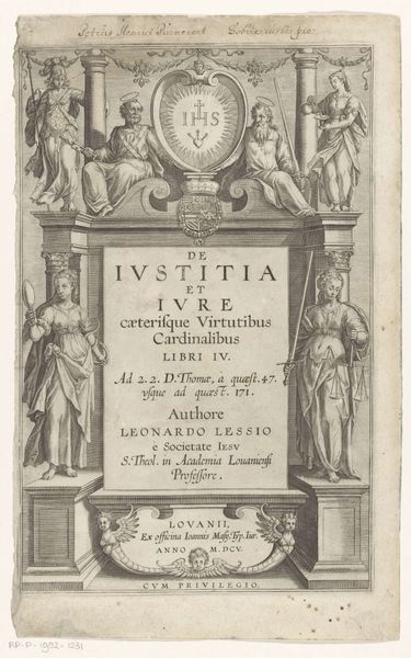
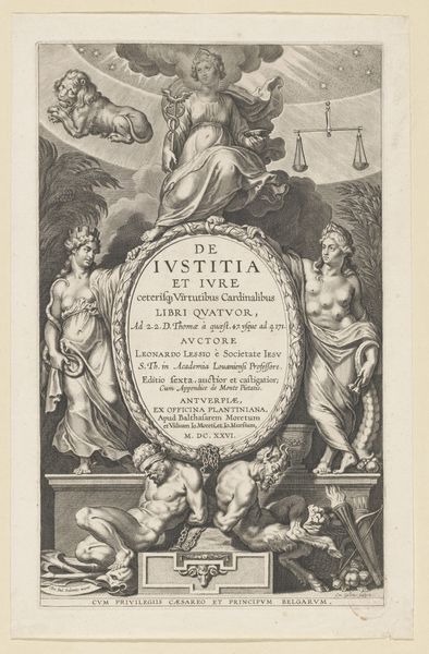
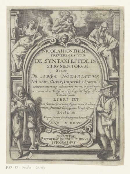
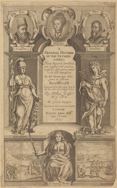
Curator: Here we have an engraving from 1612 titled "Petrus, Paulus, Voorzichtigheid en Rechtvaardigheid" which translates to "Peter, Paul, Prudence, and Justice." It’s currently housed in the Rijksmuseum. The bookplate features stark contrasts and allegorical figures surrounding text. The overall mood feels quite serious and academic. What strikes you about this piece? Editor: I'm struck by how the artist has used line to create depth and texture. It’s so intricate. What does the composition suggest to you? Curator: Observe the balanced symmetry. The central text is framed by personified virtues on either side, mirrored by figures above. The engraving is fundamentally organized around the central inscription using balance to signify order. This rigid organization, though, serves as a framework for the details to breathe. How might we read the positioning of the figures, particularly Saints Peter and Paul flanking the emblem? Editor: I suppose their elevated position and direct gazes command authority, reflecting the book's subject matter of justice and law. Curator: Precisely. Furthermore, the interplay between light and shadow creates a sense of drama characteristic of the Baroque style. The lines are dense and controlled, producing form and texture with precision. Notice how the composition is compartmentalized, with different layers visually stacked. What effect might this stacking achieve? Editor: It creates a clear visual hierarchy, I think, directing the viewer’s eye to the most important elements in stages. I see how a close formal reading unpacks these organizational components into an elegant visual statement. Curator: Exactly. Form, in this case, reinforces content. Considering what we have discussed, do you feel this has shifted your understanding? Editor: Absolutely. I initially perceived a straightforward, serious image, but now I recognize how the formal elements—line, symmetry, light—work together to construct meaning and hierarchy.
Comments
No comments
Be the first to comment and join the conversation on the ultimate creative platform.