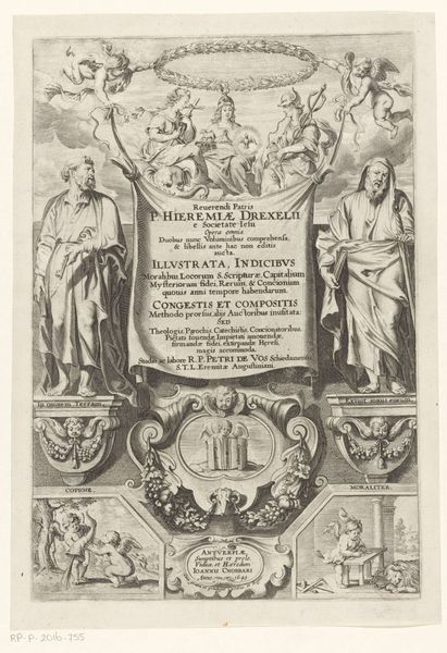
print, engraving
#
portrait
#
baroque
# print
#
figuration
#
engraving
Dimensions: height 260 mm, width 171 mm
Copyright: Rijks Museum: Open Domain
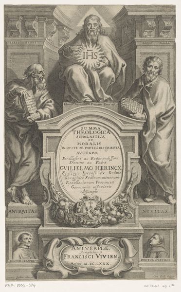
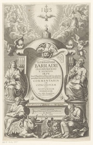
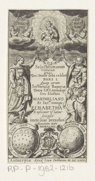
Editor: So, this engraving, "Petrus en Paulus" from 1616, at the Rijksmuseum, appears to be a title page. It feels very formal, almost architectural, with the figures flanking the central text. The fine lines create incredible detail. What strikes you most about its composition? Curator: Formally, the symmetry is quite deliberate, is it not? The composition exhibits a rigid structure, almost as though mirroring the theological order it purports to contain. Note how the figures of Peter and Paul act as supporting columns for the title cartouche, mirroring the architectural elements above. Do you see how the radiant "IHS" monogram at the apex creates a focal point, drawing the eye upwards? Editor: Yes, it's all very balanced. The eye definitely moves upward, following that vertical axis. And the textures created by the engraving technique give a tactile quality, even in a reproduction. Curator: Indeed. The engraving itself employs a meticulous system of hatching and cross-hatching to simulate depth and volume. The density of lines in the shadows and the sparser lines in areas of highlight create a convincing illusion of three-dimensionality on a flat surface. The frame further provides order and perspective in the image. Editor: I see. So the structure and the technique both contribute to a sense of order and authority. The balance and control enhance its meaning. It shows me the formal elements emphasize the importance of religion. Curator: Precisely. It provides insight to religion from this era. Editor: This really has broadened my insight into Baroque visual language. Curator: It has aided my recognition as well!
Comments
No comments
Be the first to comment and join the conversation on the ultimate creative platform.
More like this