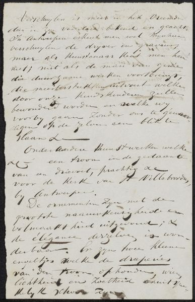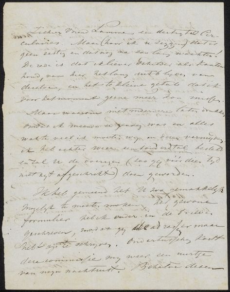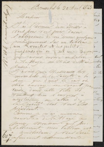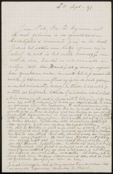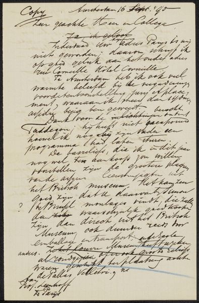
Possibly 1875
Brief aan Philip Zilcken
Listen to curator's interpretation
Curatorial notes
Curator: Here we have "Brief aan Philip Zilcken" or "Letter to Philip Zilcken" Possibly from 1875, crafted by Johannes Jacobus Franciscus Wap, it's pen and ink on paper, a handwritten letter of sorts. What's your immediate take? Editor: Raw, intimate, a glimpse into a bygone era through scratchy pen strokes. The dense, swirling script gives the impression of urgent thought trying to capture some intangible feeling. It is the script itself that draws the attention here more than the information written within. Curator: Absolutely. From a material perspective, we're looking at a confluence of readily available materials: paper, pen, and ink. Its very accessibility speaks to the democratization of communication in this period, and while we focus on "high art", things like letters open avenues to observe a kind of artistry present in daily labor and consumption. The material constraints – the nib of the pen, the absorbency of the paper – shape the final aesthetic. Editor: Yes, it is fascinating how the material directly dictates the flow, almost like a dance between artist and medium, wouldn’t you agree? This calligraphic style suggests not just writing, but almost drawing, with the letterforms becoming abstracted, ornamental in their own right. Look how Wap seems to relish the physical act of writing. The flourishes, the pressure changes…they whisper of personality and the very human desire to leave one's mark. Curator: The density of the text also implies much about the context of letter-writing then; unlike today's emails, it appears the author feels a greater imperative to fill up every available space on the page and is mindful of cost efficiencies with material, given that space would’ve been expensive to acquire. And how much the reader could understand. It also shows an emphasis on function, on content over pure aesthetic considerations which runs in direct contrast to high art. Editor: Which also infuses a certain type of warmth into a somewhat lost style. Today the gesture of writing is so removed through digital technology. Curator: Indeed. Thinking about Johannes's intention, as we look closely at this, we also must take into account Zilcken's labor, the recipient of this communication: it would've been initially unrewarding toil before eventually providing benefits. Editor: This letter serves as an artifact—a message hurled through time, retaining the writer’s essence, to our senses and, for that I’m thankful. Curator: Likewise. It's a subtle reminder that material constraints can sometimes breed the most fascinating and telling artistic statements.