print, paper, typography
#
art-deco
#
aged paper
#
homemade paper
#
paper non-digital material
#
pale palette
#
reduced colour palette
#
dutch-golden-age
# print
#
light coloured
#
sketch book
#
paper
#
personal sketchbook
#
historical fashion
#
typography
#
journal
Dimensions: height 24.3 cm, width 15.8 cm
Copyright: Rijks Museum: Open Domain
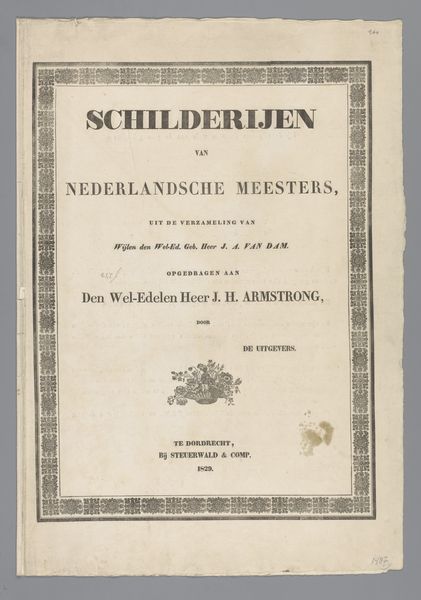
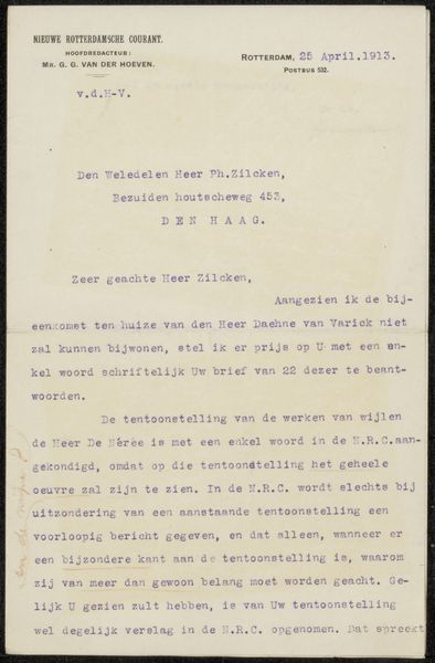
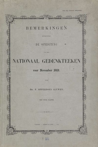
This is "Het Nederlandse Schaap" or "The Dutch Sheep" made in Amsterdam in February 1927 by Prof. H. Burger. It’s a printed page, possibly the cover of a booklet, and right away the texture grabs me. It's got that slightly yellowed, aged paper quality that hints at stories untold. I love how the design is laid out, those thin black lines forming a frame, almost like a stage for the text. The font itself, a straightforward serif, feels grounded, solid. The title looms large, assertive, while the phrase "EEN VERDWAASD VOLK" – "A bewildered people" – sits nestled below, a curious snippet that piques your interest. And that triangle, right in the center, simple and bold. What does it mean? It's this little mysterious detail that makes you want to know more. In the same way that art is this ongoing dialogue, these different elements open up a kind of space, inviting you to participate in the conversation, even if you are not sure exactly what it's about.
Comments
No comments
Be the first to comment and join the conversation on the ultimate creative platform.
