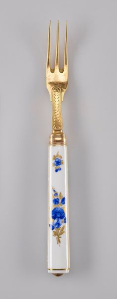
ceramic
#
ceramic
#
decorative-art
Copyright: Public Domain
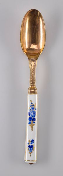
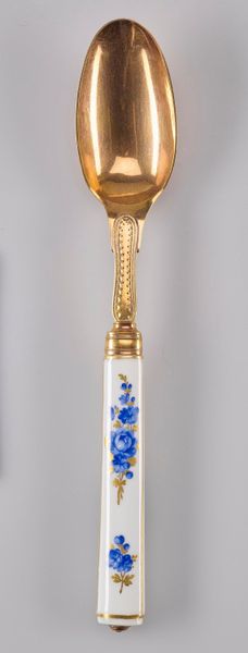
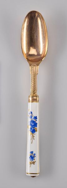
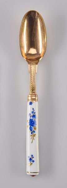
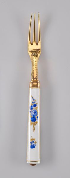
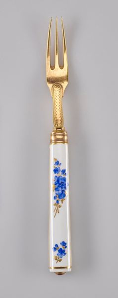
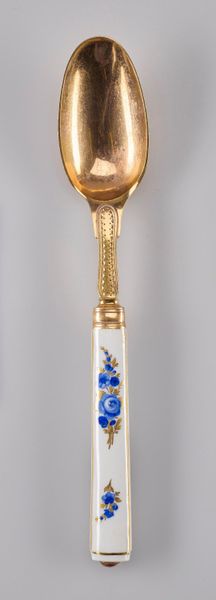
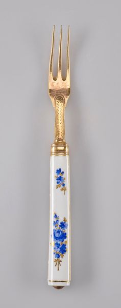
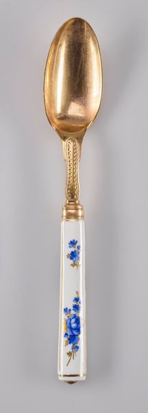
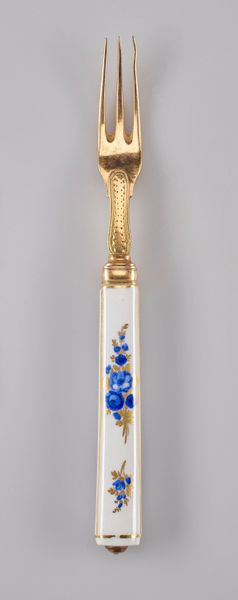
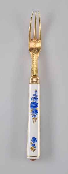
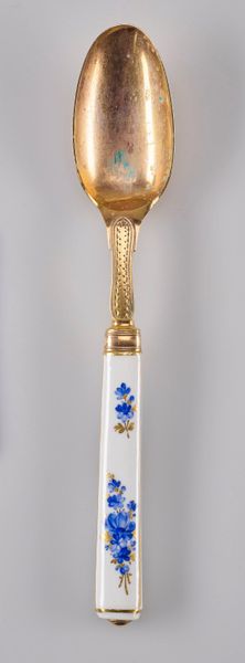
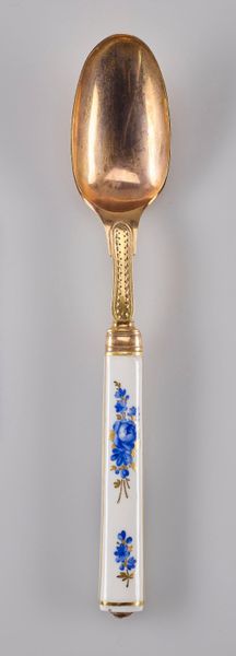
Editor: Here we have a decorative spoon from around the 18th century, crafted by the Meissen Porcelain Factory. The gold finish and painted ceramic handle with its blue flower detailing is exquisite, almost too pretty to use. What can you tell me about the form and structure of this piece? Curator: Notice the interplay of geometric forms against the organic motif of the painted flora. The spoon itself presents an ovoid concavity attached to a more angular, almost rectangular handle. How does the curvature of the spoon bowl contrast with the handle? Editor: It's a sharp contrast, the gold feels flowing and alive, while the porcelain looks very structured, but that contrast really highlights both parts. The linear beading along the neck of the spoon and on the rims around the handle is echoed by the lines of the painted stems. Curator: Precisely. Consider also the role of colour. The bright gold finish and the vibrant cobalt-blue flowers against the stark white porcelain. These colours serve to enhance certain areas of the piece but how might we view these colours in isolation of each other, divorced from any representational content? Editor: I suppose the white amplifies the blue of the flowers while muting the shine of the gold finish, the overall composition is not so jarring as each element gets its chance to take precedence without battling for dominance. This piece seems like a case study in complementary components and careful structuring. I hadn’t thought of considering a spoon in that manner. Curator: By looking at the juxtaposition of shapes and colours and other visual elements, we move toward an enriched understanding beyond its functional context. The purely aesthetic experience of this everyday object allows us to truly view its inherent form, line and beauty.
Comments
No comments
Be the first to comment and join the conversation on the ultimate creative platform.
More like this