#
neo-dada
Copyright: Piero Manzoni,Fair Use
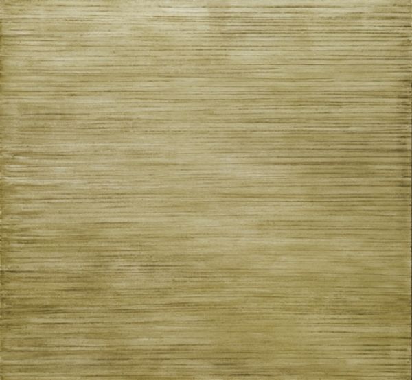
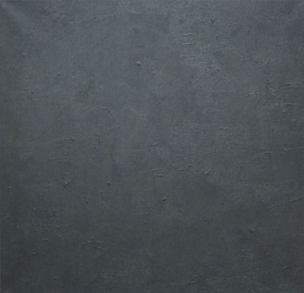
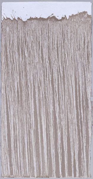
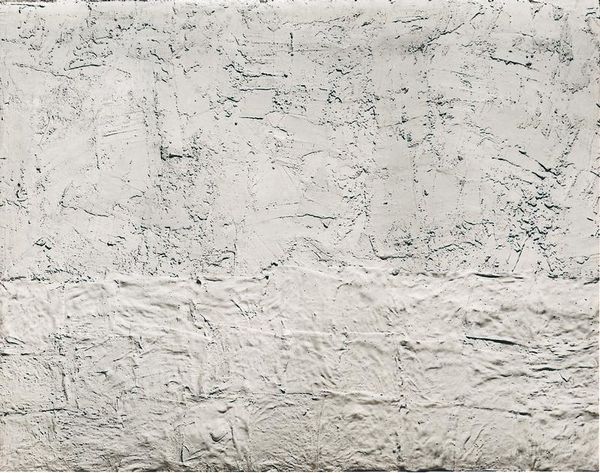
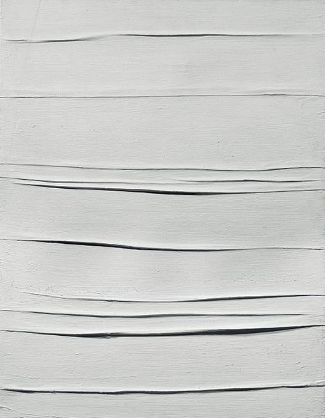
Piero Manzoni created this Achrome, a canvas soaked in kaolin, in the last decade of his short life. The kaolin, a kind of white clay, almost feels like skin, or maybe crumpled fabric, each ridge and furrow a kind of ghostly echo. The surface isn’t flat, but the process feels immediate, like it’s still wet, still happening. It’s the anti-picture, a sort of dare. What does it mean to make something without 'making' it? I find myself thinking about Rauschenberg's white paintings, where the canvas becomes a screen for light and shadow, a place to project your own thoughts and feelings. Both artists seem to be pointing towards something beyond representation, a space of pure potentiality. Like they are asking, can art just be, without having to mean? I am okay with that question.
Comments
No comments
Be the first to comment and join the conversation on the ultimate creative platform.
More like this