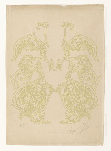
Kalenderschild van een kalender voor 1913 van het Instituut Jacob van Campen 1912
0:00
0:00
graphic-art, print, typography, poster
#
graphic-art
#
organic
#
art-nouveau
# print
#
typography
#
geometric
#
pattern repetition
#
decorative-art
#
poster
Dimensions: height 482 mm, width 304 mm
Copyright: Rijks Museum: Open Domain
Editor: So, this is the “Kalenderschild van een kalender voor 1913 van het Instituut Jacob van Campen,” a 1912 print by Walter van Diedenhoven. The typography and the organic, swirling lines give it a distinctly Art Nouveau feel. The whole thing feels very stylized, almost like a vintage advertisement. What do you see when you look at this poster? Curator: I see more than just an advertisement for an educational institution. Consider the time this poster was made, on the cusp of World War I. The stylized Art Nouveau wasn't just about aesthetics; it was often about escapism, a retreat into beauty during times of growing social and political unrest. The symmetry and repetition create a sense of order, but does that order feel reassuring or constricting to you? Editor: Hmm, I hadn’t thought about the social context. I guess it does feel a bit constricting. The repeating letters down the side seem to box in the central design. Curator: Exactly! Now consider the lettering itself: the stylized font, the capitalization. This was a time when access to education, especially professional training advertised here, was deeply tied to class and gender. Do you think the visual language reflects an attempt to project exclusivity, or perhaps accessibility? Who might have been excluded from "the most examinations and professions"? Editor: I see your point. It’s not just a pretty design. The formality and the emphasis on order could reflect the rigid social structures of the time, maybe even subtly reinforcing who had access to those opportunities. It makes me think about who was, and wasn't, being invited into the Jacob van Campen Institute. Curator: Precisely. Looking at the artwork through this lens makes it far more compelling, doesn’t it? We've gone beyond just appreciating the Art Nouveau style to understanding its potential role in reflecting and perhaps even reinforcing societal norms of the period. Editor: Definitely! I’ll never look at an old poster the same way again. There's so much more than just surface aesthetics to unpack.
Comments
No comments
Be the first to comment and join the conversation on the ultimate creative platform.
More like this