drawing, graphic-art
#
drawing
#
graphic-art
#
natural stone pattern
#
aged paper
#
toned paper
#
decorative element
#
pattern
#
repetitive shape and pattern
#
ethnic pattern
#
geometric
#
repetition of pattern
#
vertical pattern
#
pattern repetition
#
decorative-art
#
layered pattern
Dimensions: height 113 mm, width 200 mm
Copyright: Rijks Museum: Open Domain
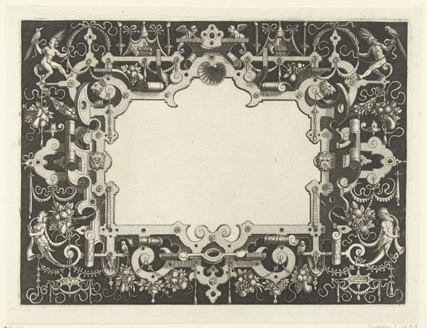
This engraving for the back of a twenty-five gulden banknote was made by Pieter Dupont, and well, it’s hard to know exactly when. What I love about this thing is how Dupont approaches design as a process of almost playful discovery, right? The banknote’s symmetrical composition is deceptive; look closely and you can see the hand of the engraver at work, revealing the texture and materiality of the printing process. The intricate floral patterns and geometric shapes, rendered in delicate lines, remind me of the graphic quality of some of Hilma af Klint’s diagrams. See how the ‘25’ is slightly off-kilter in its square? It's this kind of subtle imperfection that gives the print such an appealing tactile quality, like a fingerprint. There's something about the limitations of the printing medium that makes this work so compelling. The flat, uniform color creates a sense of depth and dimensionality. It’s not just a drawing, it’s an experience. And ultimately, isn’t that what all art is about?
Comments
No comments
Be the first to comment and join the conversation on the ultimate creative platform.
More like this