Copyright: Modern Artists: Artvee
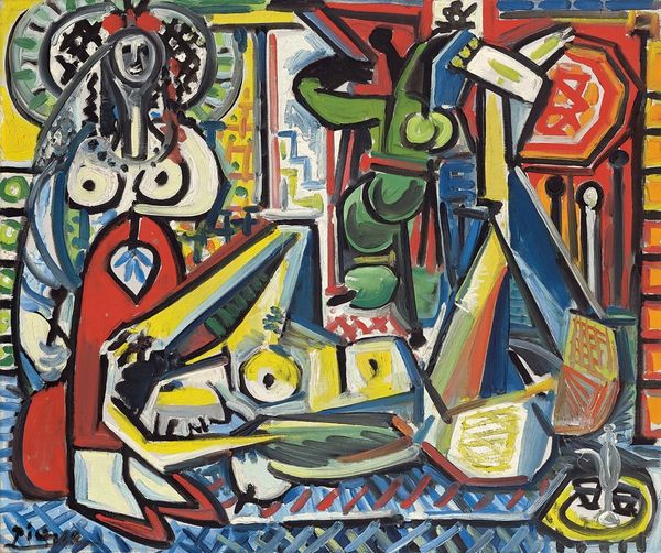
Curator: My goodness, look at this. Picasso’s "Femme couchée et personnage" from 1941—a rather bold explosion of color, wouldn't you say? The oil paint is so lush, like jewel-toned frosting. Editor: It feels almost aggressive, doesn’t it? Considering it was painted during the Second World War, that boldness reads as defiance to me. The figure is fragmented and distorted, mirroring a world in turmoil. Curator: Defiance is a great word for it. It’s got that feeling like he grabbed colors straight from a dream…or maybe a nightmare, and splashed them on the canvas with wild abandon. The way he’s mashed the perspectives, it’s so unsettling, like trying to see around corners with your eyes closed. Editor: Unsettling is right. I read this distortion as a direct commentary on the dehumanization of war. Consider how the female form, so often idealized in art history, is here rendered almost unrecognizable. This echoes the breakdown of traditional societal structures and the violence inflicted on bodies, particularly women's bodies, during conflict. Curator: See, I initially thought she looked so peaceful. Maybe she’s napping away the worries, or lost in a dream world like a flower child who's had one too many mushrooms! I mean it's just...out there. Editor: But isn’t that a deceptive reading? To see only peace ignores the underlying tensions of the time. The clashing colors, the angular forms...these are not elements of serenity. This is about a rupture of the social and personal psyche, painted on the precipice of unimaginable atrocity. And think of the title "Femme couchée et personnage"; who is this "personnage"? And what is its role here? Is it a sinister reminder of an abusive figure? Or maybe the symbolic stand-in for a dictator or fascist leader. Curator: Maybe... or maybe Picasso was bored and had some colors lying around. Look, I'm not saying the heavy themes aren’t there but he certainly lets you draw your own conclusions. The joy of the bold color creates a delicious tension when read against that period, creating a dissonance within the piece. The more I look, the more I can read into it and then strip it bare again, until it is just beautiful colour and shape! Editor: Perhaps the point *is* the perpetual interpretive tension between artistic genius and historical circumstance. A question of intention and interpretation... of form, color and how art history impacts us as people of color and feminists, or people of different cultural and social background as well! Thank you! Curator: An absolutely beautiful work and conversation that makes my synapses fire. What’s next?
Comments
No comments
Be the first to comment and join the conversation on the ultimate creative platform.