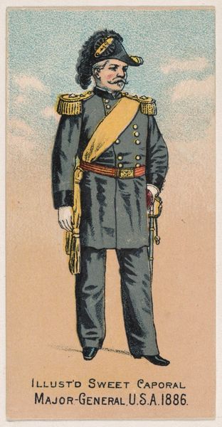
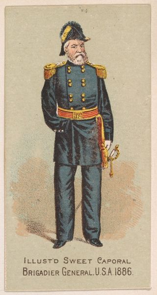
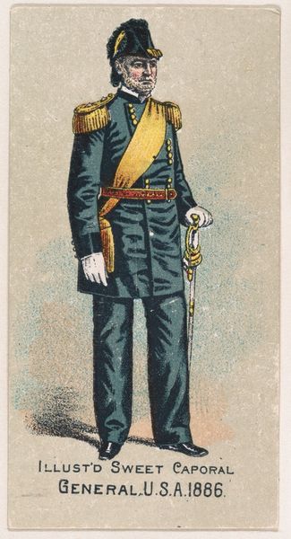
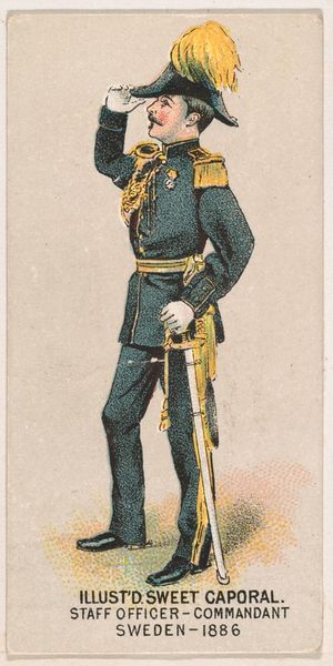
Lieutenant General, United States Army, 1886, from the Military Series (N224) issued by Kinney Tobacco Company to promote Sweet Caporal Cigarettes 1888
drawing, print
portrait
drawing
caricature
caricature
men
watercolour illustration
genre-painting
academic-art
Dimensions: Sheet: 2 3/4 × 1 1/2 in. (7 × 3.8 cm)
Copyright: Public Domain
Editor: This is "Lieutenant General, United States Army, 1886," a print from 1888, part of the Military Series by Kinney Tobacco Company. It has this fascinating caricature style, but feels surprisingly formal in its composition. What jumps out to you? Curator: Immediately, it's the orchestration of colour. The artist has used a tight palette - focusing primarily on gold, navy, and shades of ivory - creating a visually appealing pattern that unifies the composition. How does the placement of these colours strike you? Editor: Well, the gold really pops – it draws your eye right to his shoulders and sash, suggesting authority and power. But the navy suit and soft backdrop, temper the caricature. Curator: Precisely. It creates a compelling visual tension. The gold serves a structural function too –notice how it frames the central navy block. Consider the subtle repetition of circular forms - the buttons on the coat, the hat ornament, even the implied curvature of the moustache, playing against the straight lines of his sword. Do you think the image effectively balances these geometric elements? Editor: I think so. The straight lines give it that formal feeling, but the repeating curves feel almost playful given it’s from a cigarette card. I wouldn't have noticed those curves without you pointing them out. Curator: And consider how the light defines the volume of the general, lending him weight despite the two-dimensional medium. There's a push and pull between line and mass that animates the figure. It all serves to create visual interest beyond the promotional function of the print. Editor: I see it now, looking at the light and shadow. It makes me appreciate how much consideration went into something that would seem, at first glance, to be pretty simple. Curator: Indeed. And, through close examination of such prints, we may gain insights into late 19th century artistic principles concerning visual balance and tonal interplay. Editor: Definitely food for thought! I’m keen to delve deeper into understanding the language of art and its clever design.
Comments
No comments
Be the first to comment and join the conversation on the ultimate creative platform.