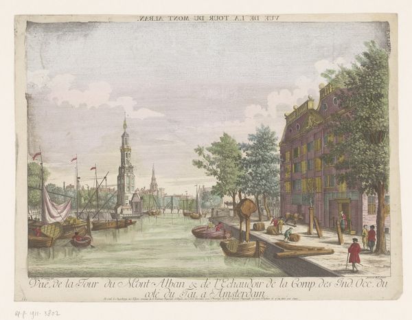
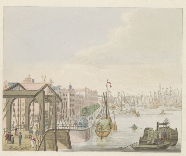
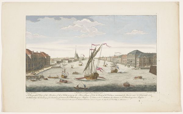
Gezicht op de Halvemaansbrug over de Amstel te Amsterdam 1755 - 1779
0:00
0:00
kaiserlichfranziskischeakademie
Rijksmuseum
drawing, print, etching, paper, watercolor
#
drawing
#
water colours
#
dutch-golden-age
# print
#
etching
#
landscape
#
paper
#
watercolor
#
coloured pencil
#
cityscape
#
genre-painting
Dimensions: height 314 mm, width 424 mm
Copyright: Rijks Museum: Open Domain
Curator: This scene almost feels staged. There’s a stillness, despite all the implied activity of a city. Editor: Indeed. What we're seeing is titled "View of the Half-Moon Bridge over the Amstel in Amsterdam." It's believed to be a print, incorporating etching, with watercolor and possibly colored pencil additions, created sometime between 1755 and 1779. The location, of course, is our very own Rijksmuseum. Curator: The use of color is quite deliberate, don't you think? Those pastel buildings – they almost feel like props in a theater set, not quite grounded in reality. It makes you wonder what symbolic weight those color choices carried. Editor: I agree, there is a deliberate artifice. Consider the Dutch Golden Age’s emphasis on civic pride and burgeoning mercantile power. Prints like these weren’t simply topographical records; they served as advertisements, showcasing Amsterdam’s prosperity to both its citizens and the wider world. The composition leads the eye along the water, connecting the various sites of commerce and leisure. Curator: And the bridge itself becomes this crucial connecting point, a symbol of passage and connection in a rapidly growing urban center. The people crossing, the boats passing under – it's all about movement and the exchange of ideas, of course also goods. Do the colors of their clothing signify particular guilds, I wonder? Editor: It’s interesting how the cityscape flattens into a series of façades. Perhaps this technique minimizes any sign of poverty, and focuses on commerce, projecting an image of wealth. Notice the subtle gradations in the sky. Curator: Those touches of light lend a kind of timelessness, a suggestion of perpetual spring or summer that is also hopeful and serene. Editor: The precision is what captivates me, documenting Amsterdam at the height of its influence. The very act of depiction contributes to the narrative of progress. Curator: I’m most drawn to those gentle colors, that almost idealized serenity. It invites contemplation, to envision what lies beneath and behind the facades depicted so clearly for public consumption. Editor: Absolutely. It serves as a powerful reminder of the complex interplay between art, society, and the construction of collective memory.
Comments
No comments
Be the first to comment and join the conversation on the ultimate creative platform.
More like this