drawing, ink
#
drawing
#
water colours
#
asian-art
#
ink
#
calligraphy
Dimensions: 22 5/8 × 25 5/16 in. (57.47 × 64.29 cm) (image)48 7/16 × 30 13/16 in. (123.03 × 78.26 cm) (mount, without roller)
Copyright: Public Domain
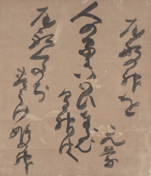
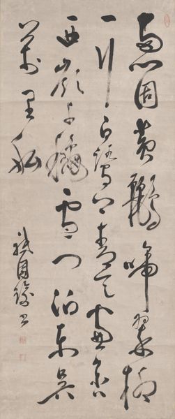
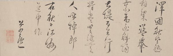
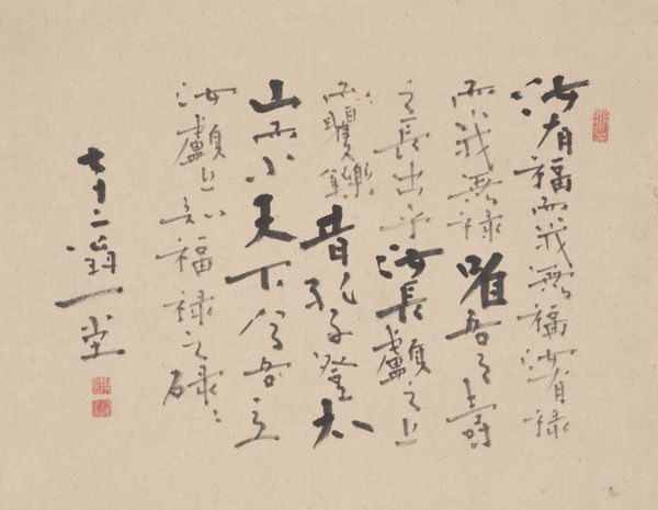
Curator: The artwork before us is called "Long Life", created in 1823 by Kameda Bōsai. It's an ink and watercolour drawing on paper, currently residing here at the Minneapolis Institute of Art. The cursive script really captures my eye... it has a spontaneous feel. What catches your attention? Editor: The placement of the characters! They don’t seem to follow any linear structure I understand. What dictates how the forms occupy space on the pink canvas? Curator: Precisely! Observe the dynamism created by the varied thicknesses and directional strokes of the ink. The tension arises not only from the contrast of thick and thin, but also from the interplay between the positive and negative space. Do you perceive how the artist orchestrates these elements? Editor: I think so! It's like a dance – the eye jumps around, tracing lines and shapes. It keeps the viewing experience active and unpredictable. So, there isn't necessarily an intention for someone to read it in a particular direction? It is the gesture that matters the most? Curator: To some extent, yes. The emphasis is more on the aesthetic qualities of the brushstrokes, their inherent energy, than on purely linguistic communication. Consider the textures created by the ink – the pools of darkness versus the dry, fleeting strokes. It’s more than mere legibility. It explores mark-making. Editor: This feels so different from how I approach text! I keep wanting to look for a start and end, like there's an essay I should be decoding. But you're saying that visual appreciation transcends traditional textual consumption here. Curator: Precisely. The artwork foregrounds the tactile nature of the ink, its visual weight. The calligraphic form functions almost abstractly, divorced from its conventional role as a vehicle for textual content. Editor: I see it now – the focus on the artist's physical movements and materials. This lens truly gives me a new way of appreciating what is in front of me. Curator: Indeed. It moves away from meaning, towards appreciation.
Comments
minneapolisinstituteofart over 2 years ago
⋮
Kameda Bōsai was a scholar, artist, calligrapher, social commentator, and poet; highly respected among literati circles but regarded as non-conformist by the administration. His popularity among collectors and his fellow artists is attested to by the number of forgeries of his work in circulation. “Longevity” was written after his long-failing health suffered a sharp decline. Although he was then partially paralyzed and struggling to speak, Bōsai’s celebration of his unexpected longevity in the style of a waka (Japanese-style) poem is among the most visually lyrical of his body of work. He begins on the right with an ink-soaked brush that bleeds luxuriantly into the silk. The following verse is written in a fine, loose cursive script. 壽 わがトしにあや / かれかしとは / おこがまし / いされどもことし / 七十にLong Life / To say that others should reach the same age would be / Quite presumptuous. / Nevertheless, this year I have become seventy-two!(Trans. Stephen Addiss)
Join the conversation
Join millions of artists and users on Artera today and experience the ultimate creative platform.
More like this