Copyright: Modern Artists: Artvee
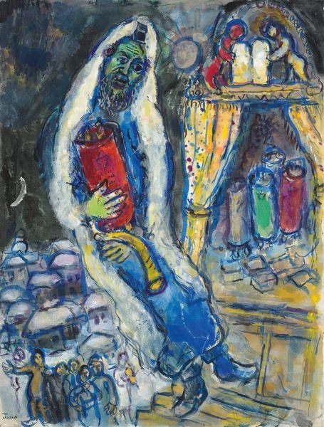
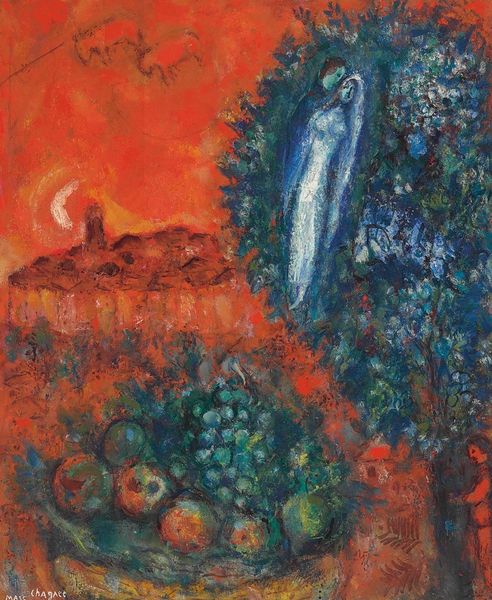
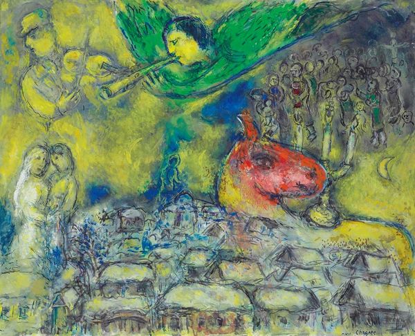
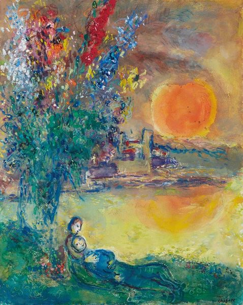
Editor: Here we have Chagall’s "Violoniste dans le clair de lune orangé à Vitebsk," created in 1974 using oil paint. It feels dreamlike to me, a warm memory tinged with melancholy. The violinist almost floats above the town. What do you see in this piece, considering its formal elements? Curator: Note the strong contrast in the palette. The pervasive oranges create a cohesive, warm atmosphere, while blues and greens offer localized dissonance. Examine how these chromatic choices articulate spatial relations within the pictorial space. What effect is created by the inverted perspective and dislocated elements? Editor: I guess the warped perspective flattens the picture plane and emphasizes the abstract nature of the image, making it feel less like a realistic landscape. Curator: Precisely. Now, consider how Chagall manipulates texture through his brushwork. Notice the difference in the treatment of surfaces – from the rough, almost impasto-like application in the buildings, to the smoother handling of the figures. Can we connect these technical disparities with the subject and overall mood of the artwork? Editor: I see. The thicker paint creates more tactile forms while other areas suggest distance and less physicality. I've definitely gained a deeper understanding of the painting’s design elements. Curator: Indeed. A work of art should never be seen solely in the guise of cultural artefact, nor only historical token; to consider it solely in those terms is to misunderstand it fundamentally. With a keen sensitivity to its internal operations we start to grasp the magnitude of a painter such as Chagall. Editor: Thanks, I'll be sure to bring more scrutiny and awareness to other works of art.
Comments
No comments
Be the first to comment and join the conversation on the ultimate creative platform.
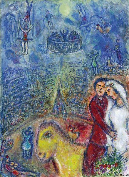
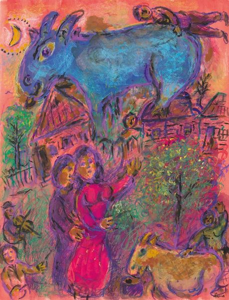
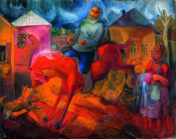
More like this