Copyright: CC0 1.0
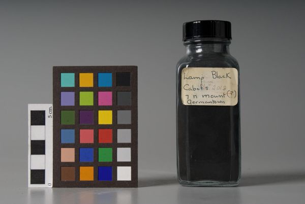
Editor: We're looking at "Lamp Black," manufactured by R.R. Cameron. The label says Cambridge, 1928. The stark contrast between the black pigment and the color chart is striking. What draws your eye in this composition? Curator: The formal arrangement is meticulously calibrated. Note how the chromatic scale beside the jar accentuates the density of the black pigment. The label itself, askew, introduces a subtle disruption to this otherwise ordered structure. Editor: So, the asymmetry of the label is significant? Curator: Precisely. It introduces a human element, disrupting the industrial aesthetic, and forcing the viewer to confront the inherent tensions between order and chaos within the piece. The jar’s cylindrical form also plays against the straight edges of the chart. Editor: I see. It's a much more complex interplay than I initially perceived. Curator: Indeed. The work invites us to consider the very nature of colour and its representation.
Comments
No comments
Be the first to comment and join the conversation on the ultimate creative platform.
More like this